Our logo
Horizontal
The horizontal version of our logo is the preferred choice for all communications.
We have 2 main versions of our horizontal logo: Primary — our full color version of our logo and Secondary — a reversed color version.
Primary logo — full color

Download
- svg
- Scalable vector format
- eps
- Scalable vector format
- png
- jpg
- gif
Secondary logo — full color reversed

Download
- svg
- Scalable vector format
- eps
- Scalable vector format
- png
- jpg
- gif
Single color celeste

Download
- svg
- Scalable vector format
- eps
- Scalable vector format
- png
- jpg
- gif
Single color gray

Download
- svg
- Scalable vector format
- eps
- Scalable vector format
- png
- jpg
- gif
Single color black

Download
- svg
- Scalable vector format
- eps
- Scalable vector format
- png
- jpg
- gif
Single color white

Download
- svg
- Scalable vector format
- eps
- Scalable vector format
- png
- gif
Vertical
The vertical version of our logo should only be used in limited situations where the horizontal logo can not be used due to space concerns.
Vertical primary logo — full color on white

Download
- svg
- Scalable vector format
- eps
- Scalable vector format
- png
- jpg
- gif
Vertical secondary logo — reversed on white

Download
- svg
- Scalable vector format
- eps
- Scalable vector format
- png
- gif
Vertical single color celeste

Download
- svg
- Scalable vector format
- eps
- Scalable vector format
- png
- jpg
- gif
Vertical single color gray

Download
- svg
- Scalable vector format
- eps
- Scalable vector format
- png
- jpg
- gif
Vertical single color black

Download
- svg
- Scalable vector format
- eps
- Scalable vector format
- png
- jpg
- gif
Vertical single color white

Download
- svg
- Scalable vector format
- eps
- Scalable vector format
- png
- gif
Symbol
Symbol — celeste

Download
- svg
- Scalable vector format
- eps
- Scalable vector format
- png
- jpg
- gif
Symbol — gray

Download
- svg
- Scalable vector format
- eps
- Scalable vector format
- png
- jpg
- gif
Symbol — black

Download
- svg
- Scalable vector format
- eps
- Scalable vector format
- png
- jpg
- gif
Symbol — white

Download
- svg
- Scalable vector format
- eps
- Scalable vector format
- png
- gif
Partner Space
Primary logo — full color

Download
- svg
- Scalable vector format
- eps
- Scalable vector format
- png
- jpg
- gif
Secondary logo — full color reversed

Download
- svg
- Scalable vector format
- eps
- Scalable vector format
- png
- gif
Logo colors
Our logo should only be used in the following colors:

Primary logo — full color on white
Name: celeste (Celeste)
HEX: #34cdd7
RGB: rgb(52, 205, 215)
Name: grayDarkest (ESM Gray)
HEX: #2b2a2e
RGB: rgb(43, 42, 46)
Clear space
Clear space is the term for the area around our logo that no other graphic element, logo, or content should intrude into. This area is equal to 50% of the height of our word mark.
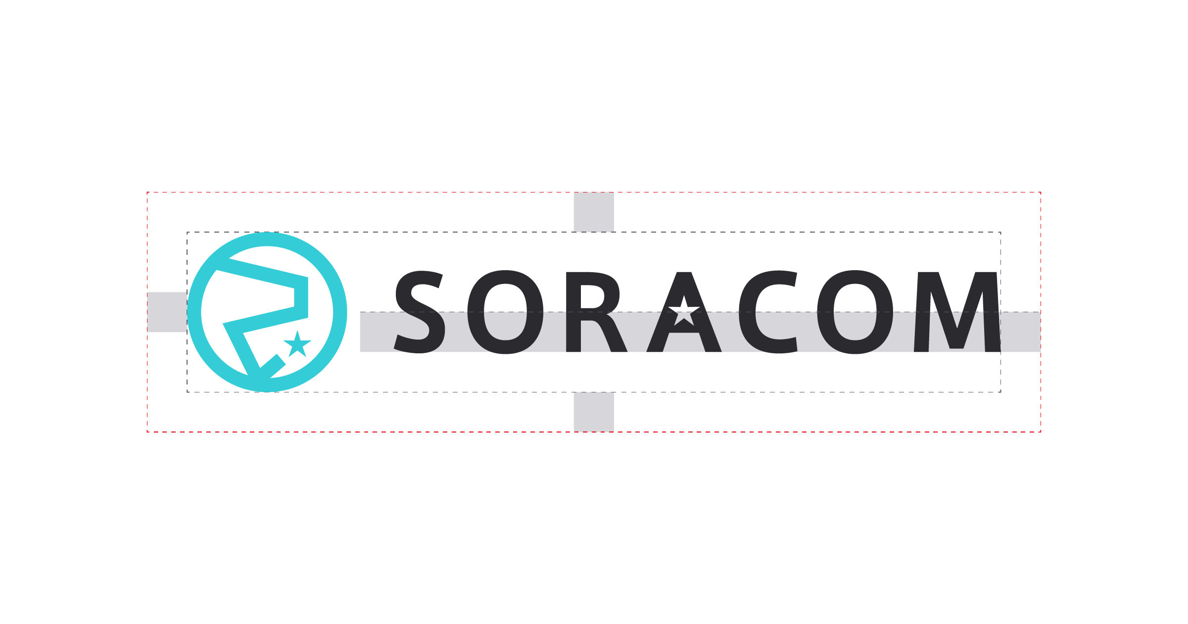
Our logo clear space
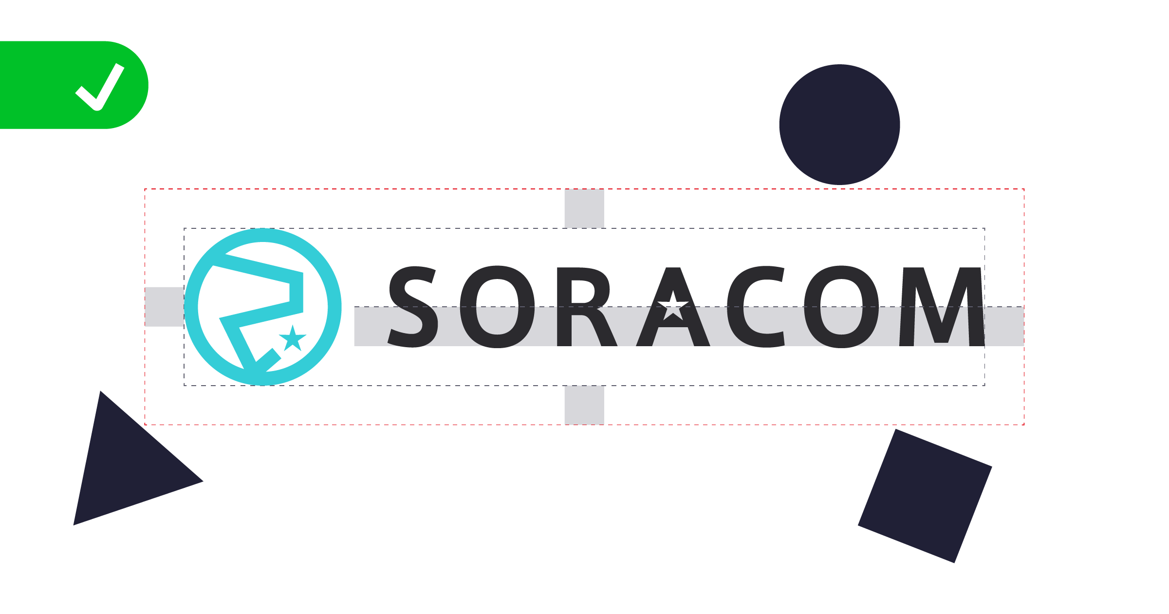
Correct use of clear space
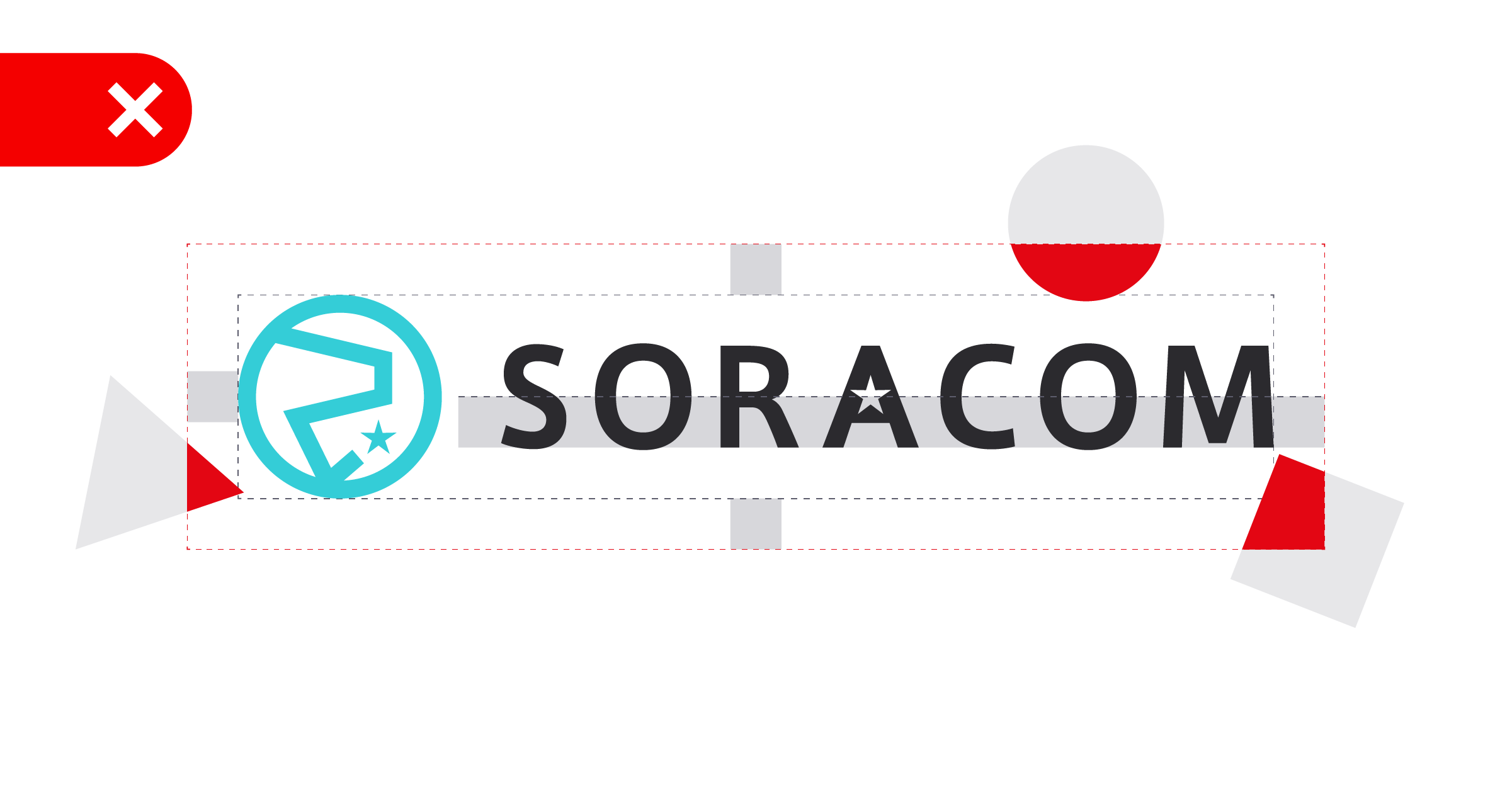
Incorrect use of clear space
Logo size
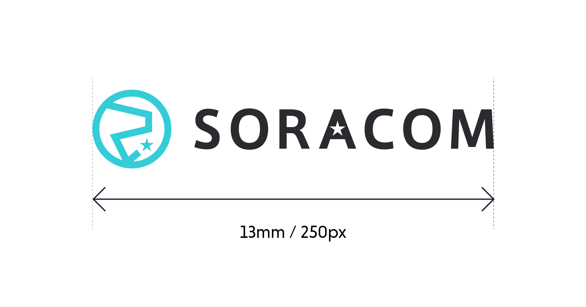
The minimum size for the logo is 13mm or 250px wide. It should not be used smaller than this. There is no maximum size.
Logo usage
Our logo should only be used as shown in these guidelines. Any other use can reflect badly on our brand. Here are some specific things that should be avoided:
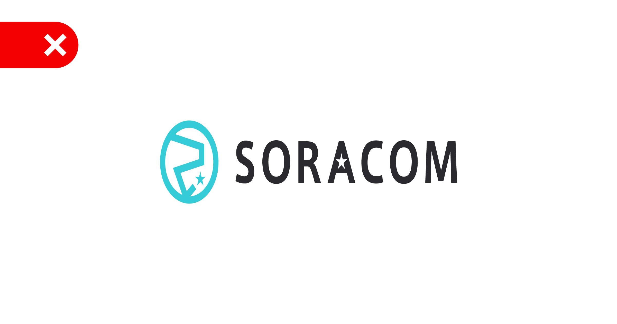
DO NOT squash or stretch the logo
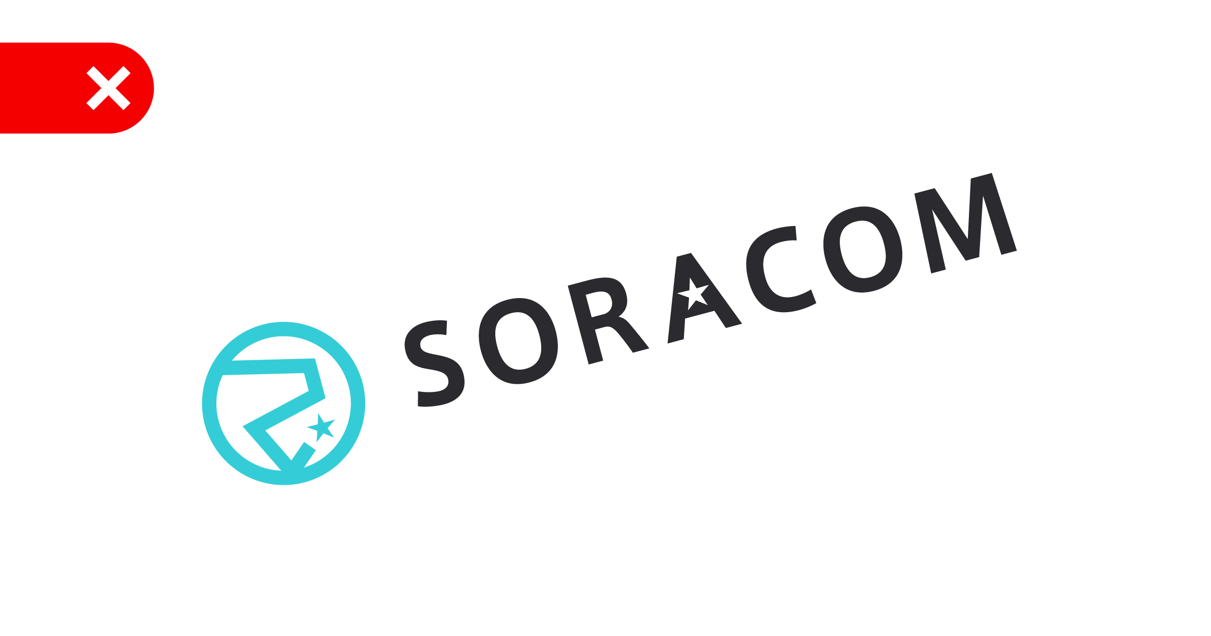
DO NOT rotate the logo
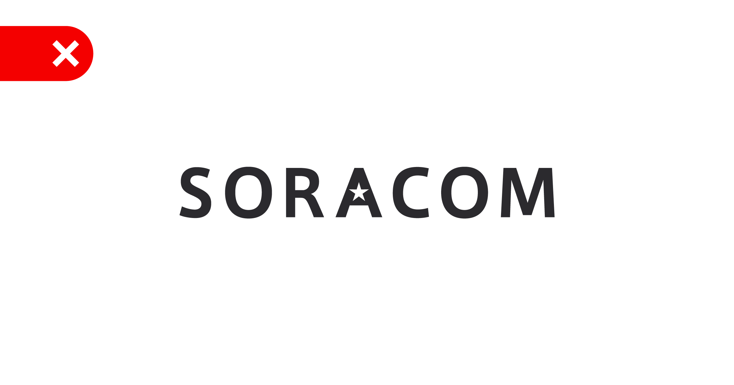
DO NOT remove the icon from the logo
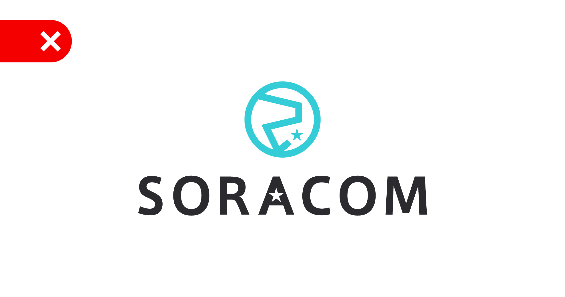
DO NOT rearrange the elements of the logo
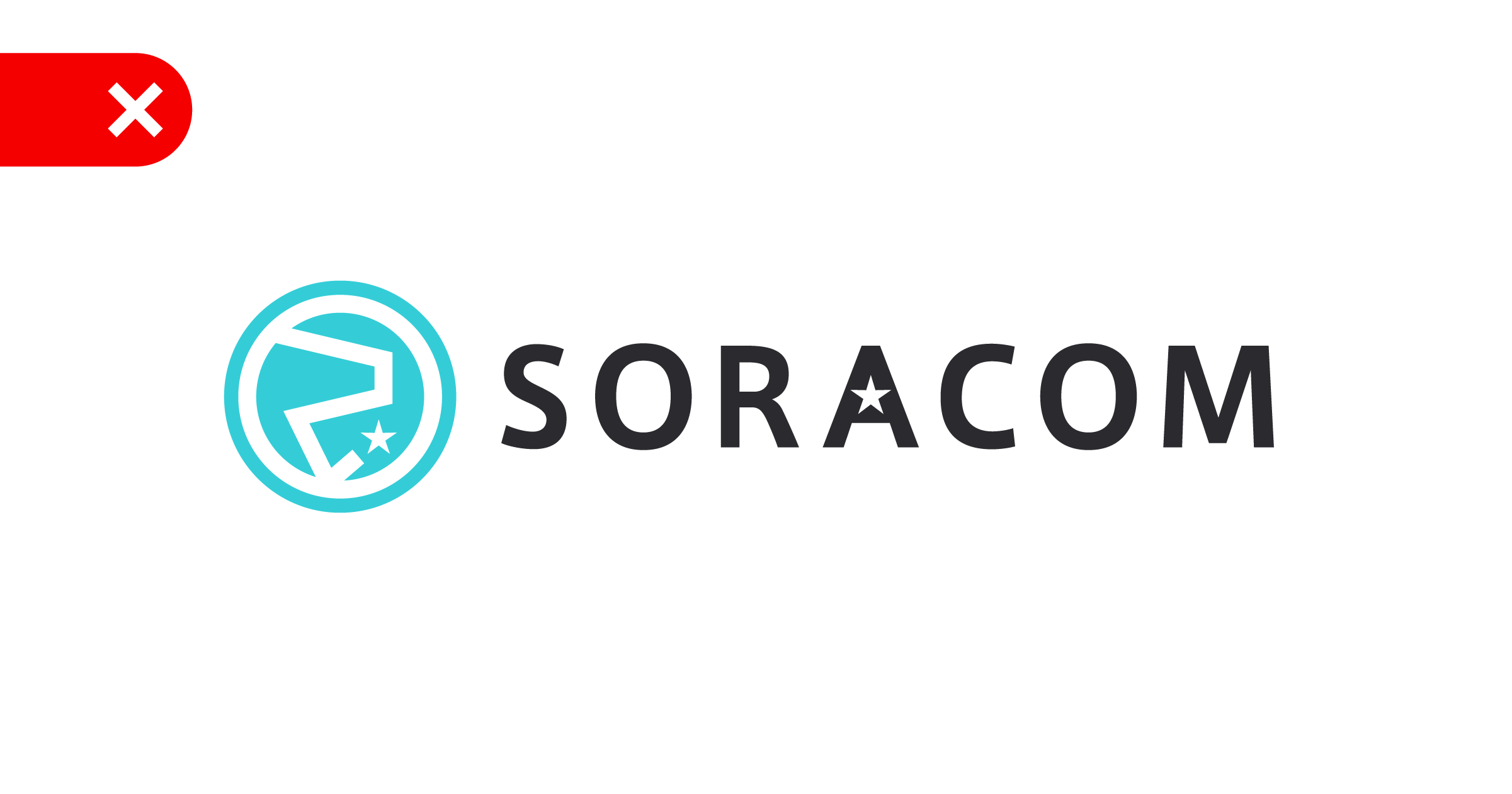
DO NOT change the icon
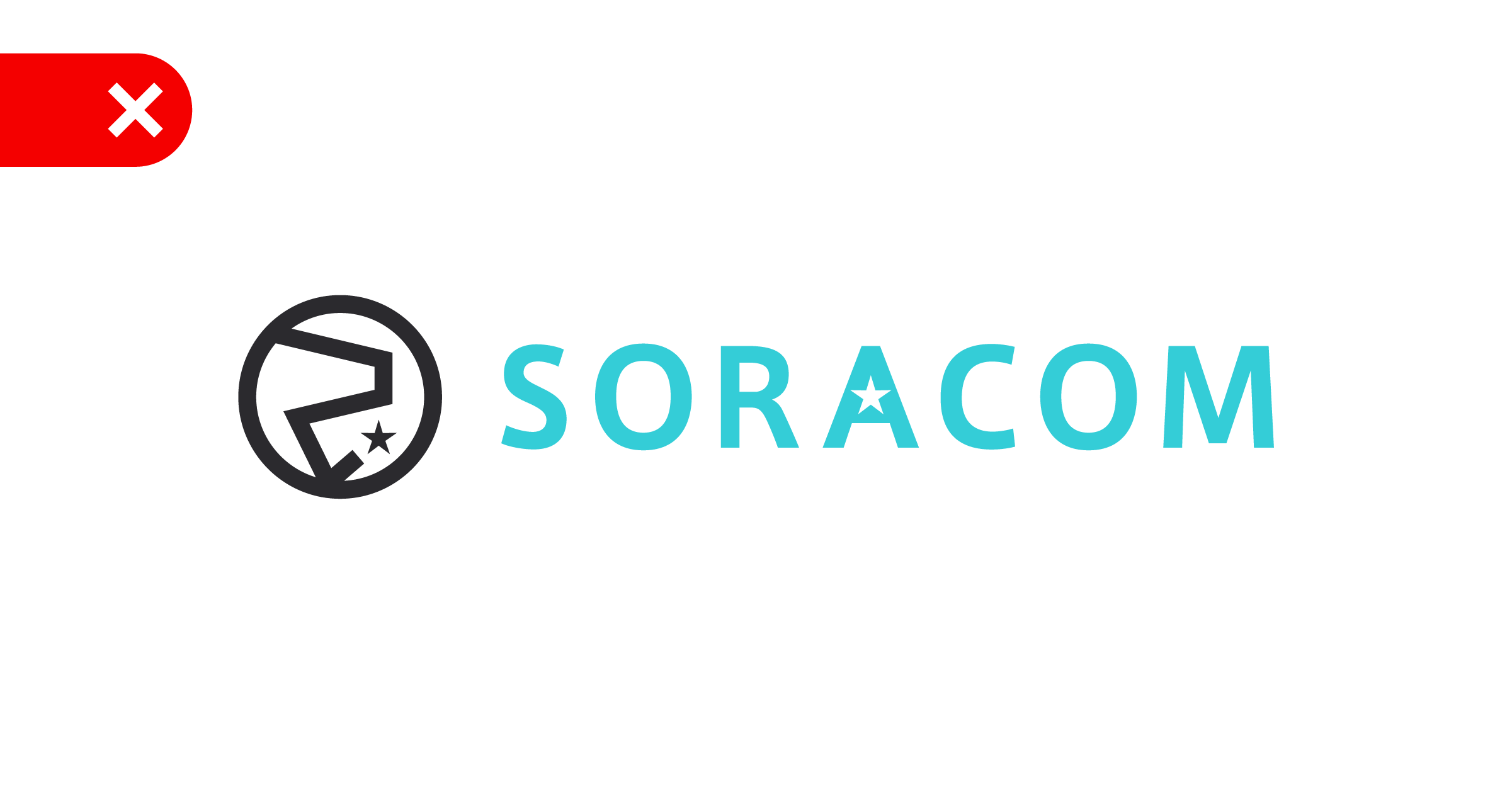
DO NOT swap the colors of the logo
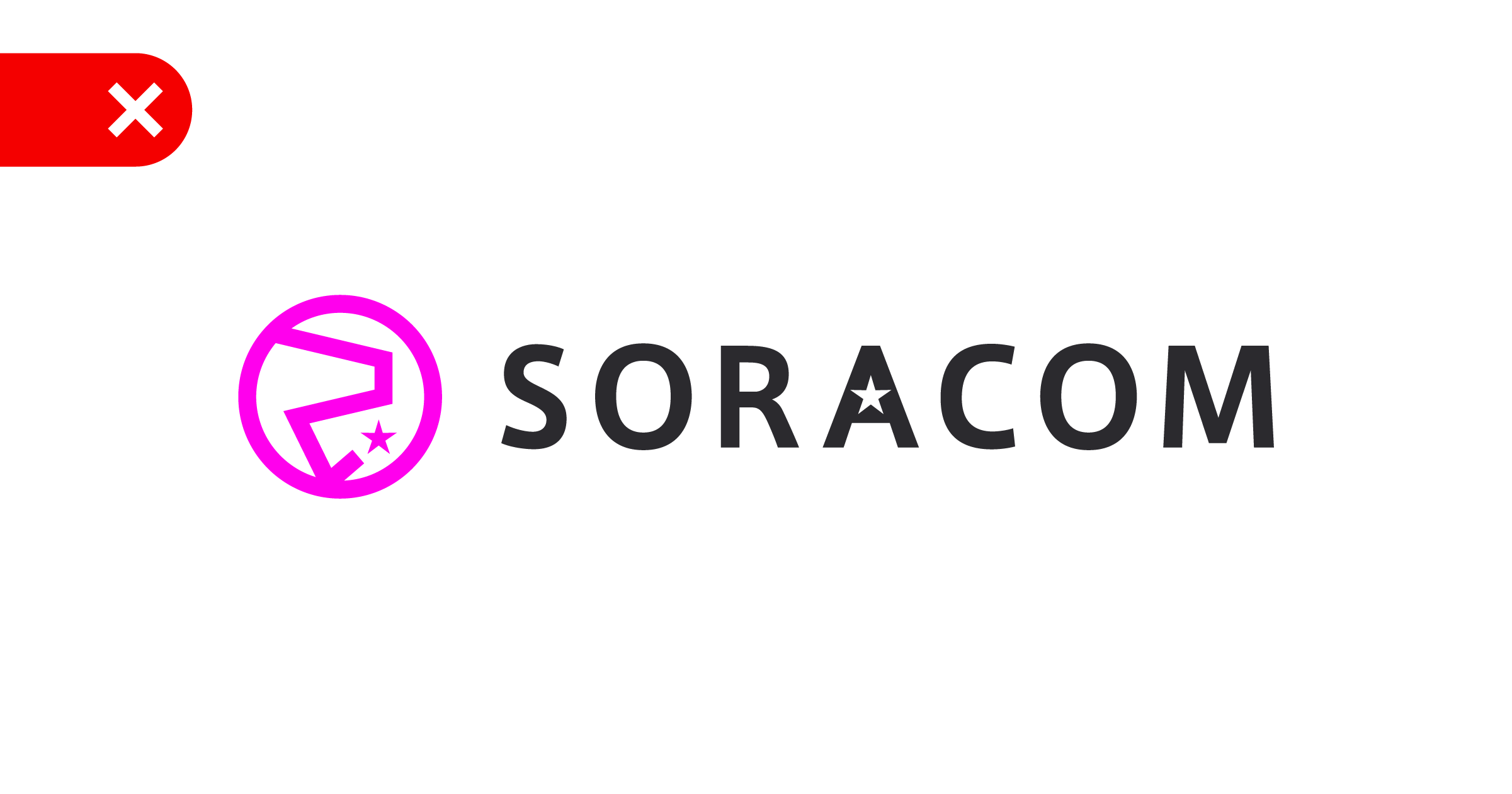
DO NOT use other color combinations
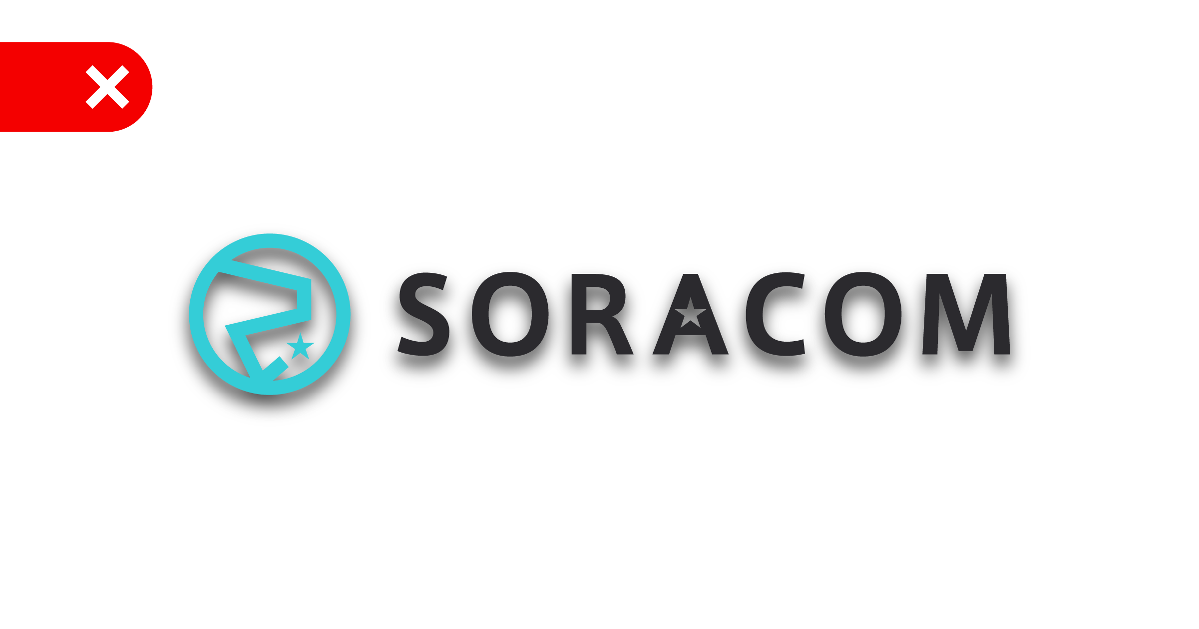
DO NOT add effects or shadows to the logo
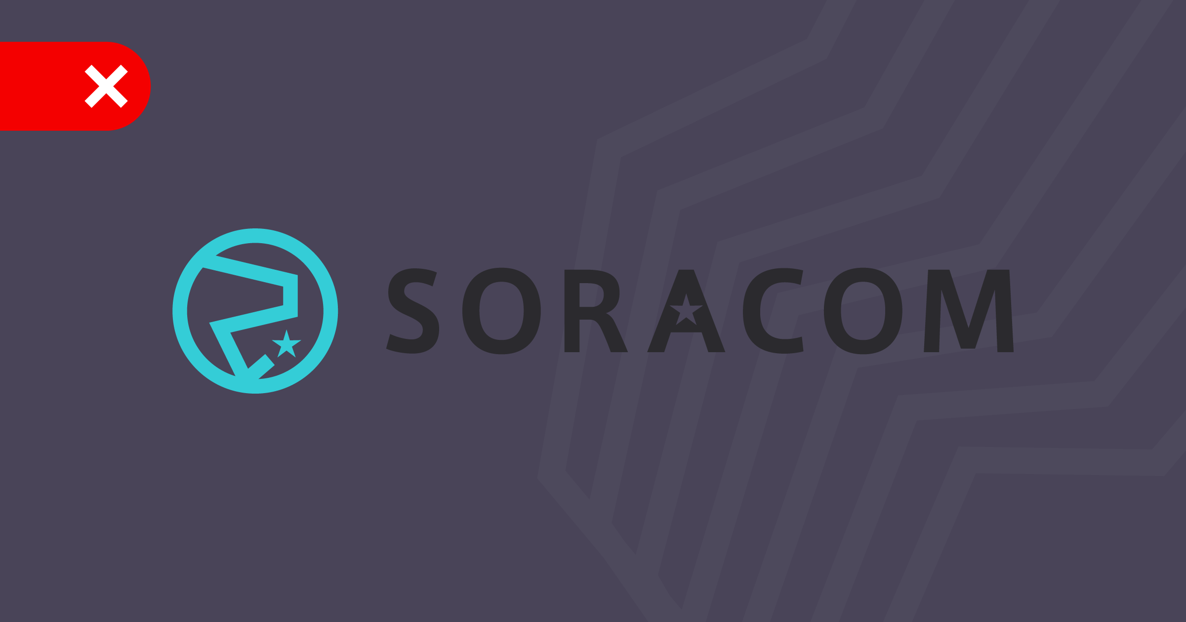
DO NOT use the primary logo on colored backgrounds
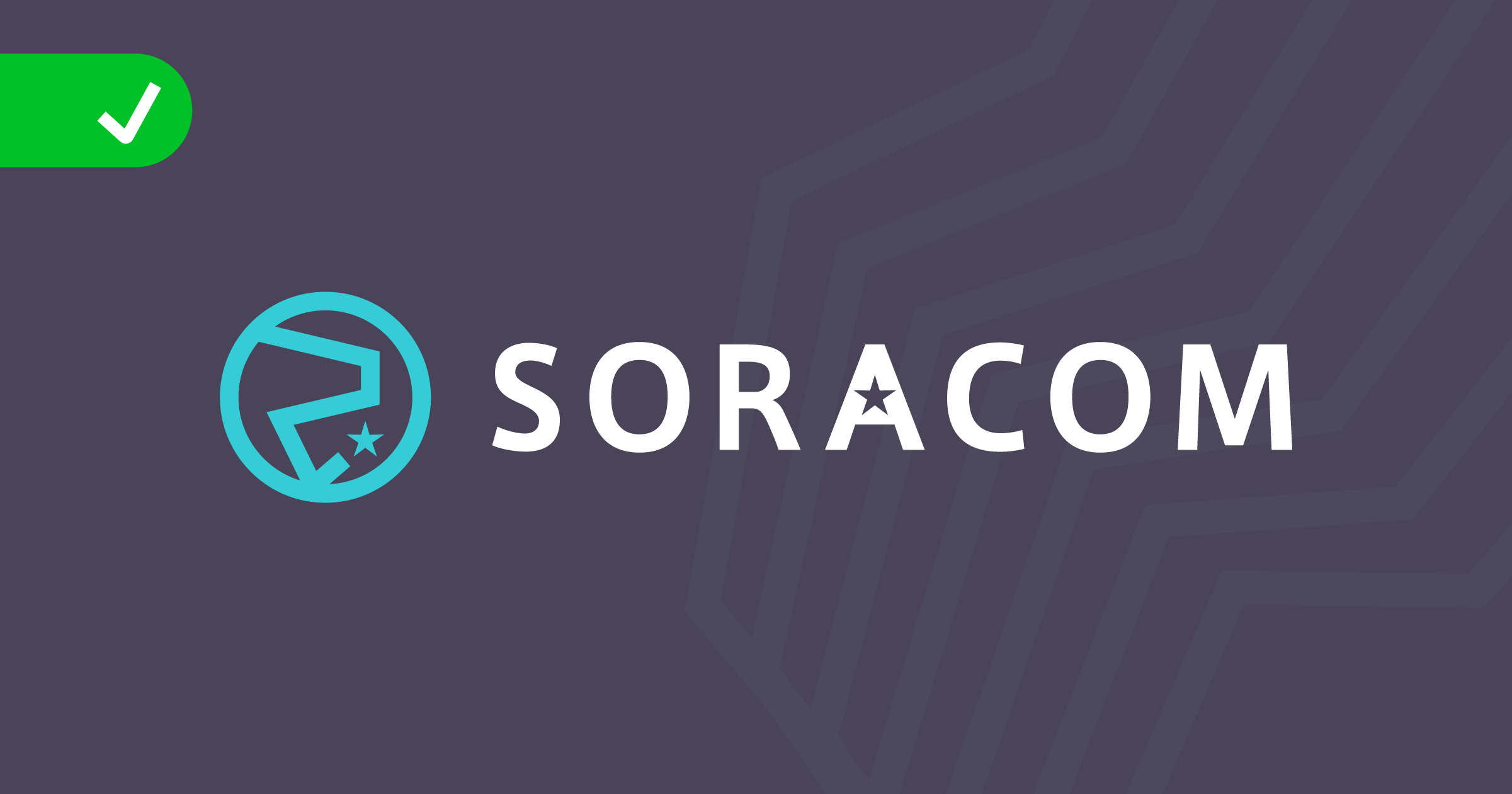
DO use the secondary logo on colored backgrounds
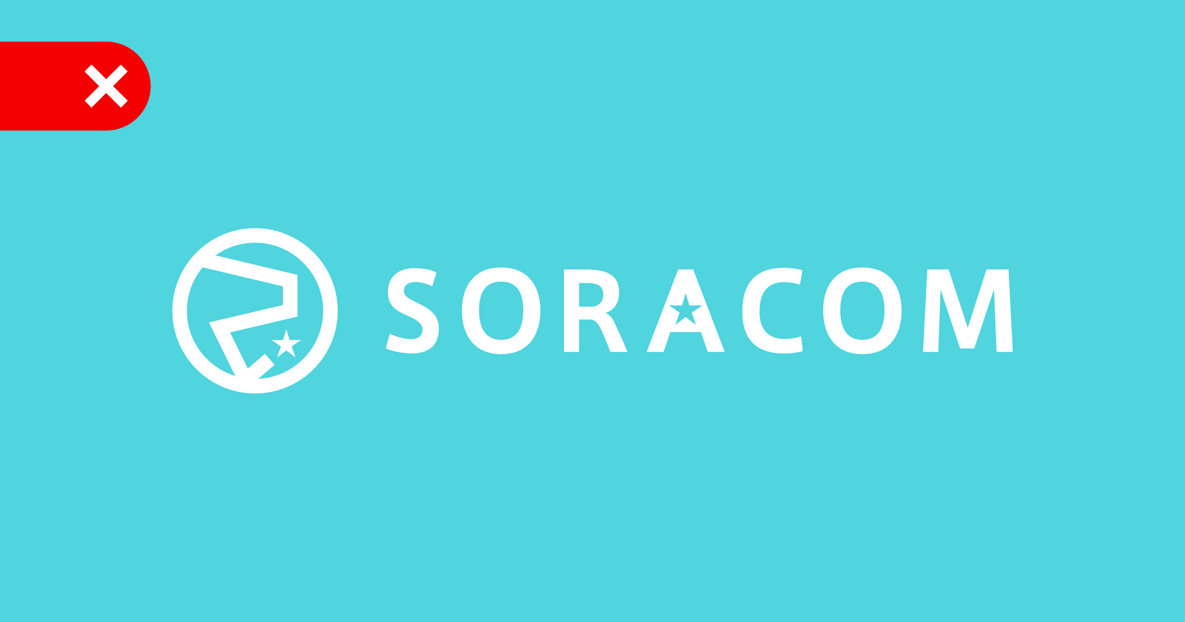
DO NOT use the white mono version on Celeste
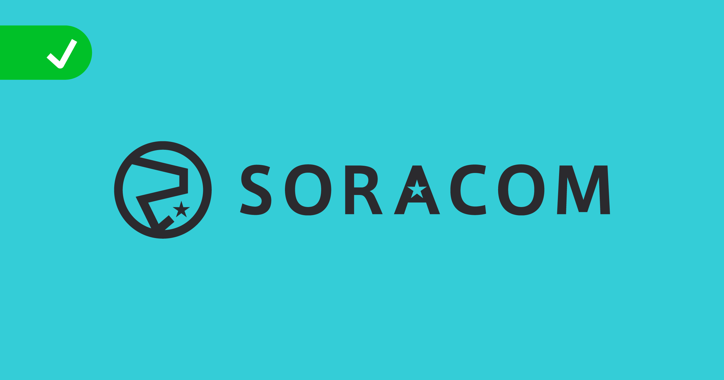
DO use the grey or black mono version on Celeste
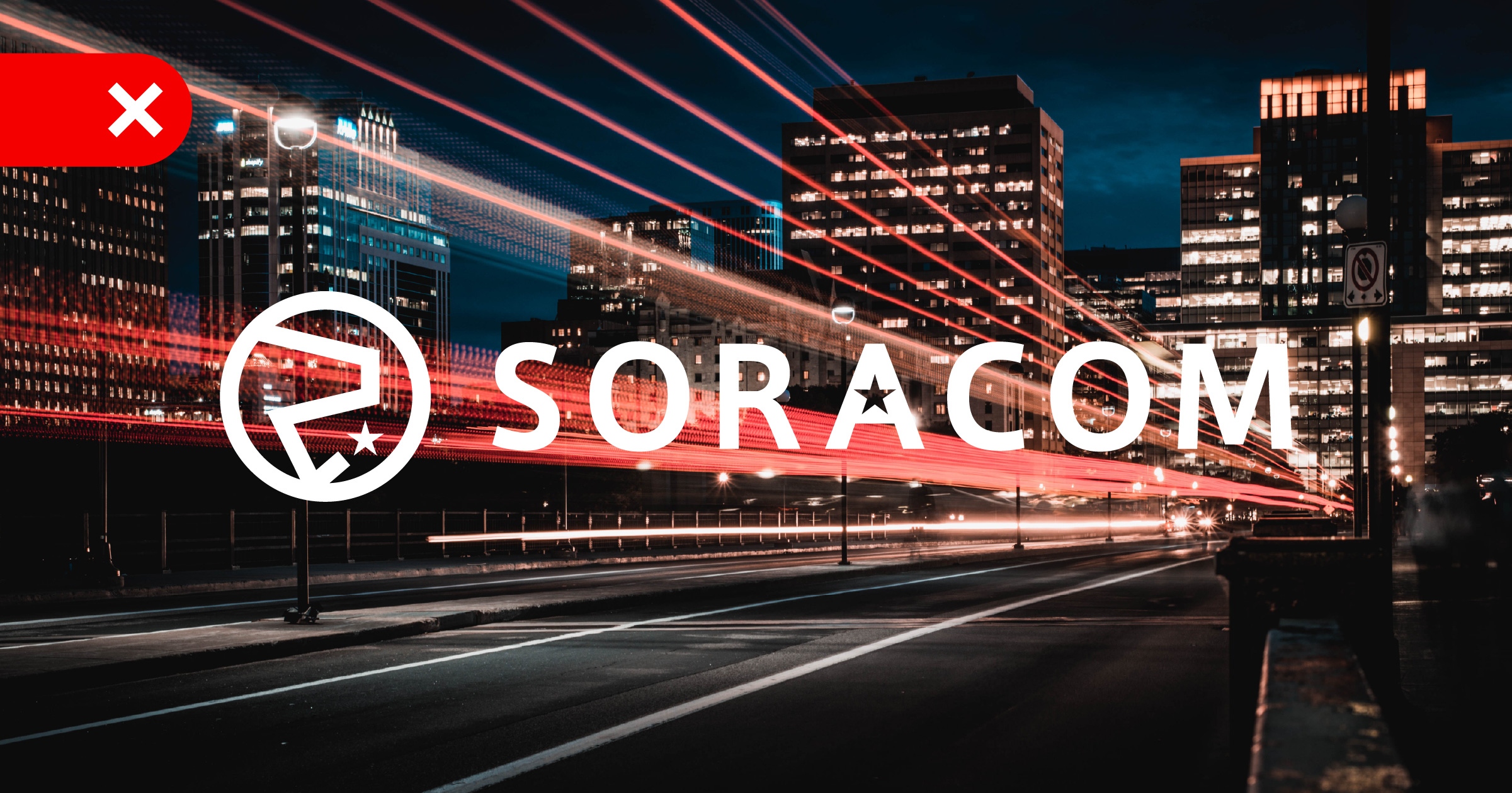
DO NOT use the mono version on images which make hard to read

DO darken images to ensure the logo is easy to read
Social Media and Avatars
See social media guidelines