Primary color palette
Name: celeste (Celeste)
OKLCH: oklch(77.67% 0.1218 201.68deg)
HEX: #34cdd7
Name: grayDarkest
OKLCH: oklch(23.39% 0.008 298.27deg)
HEX: #1e1d21
Secondary color palette
Our secondary color palette is made up of bold and bright colors that add depth to our brand.
Name: mauveDark
OKLCH: oklch(38.59% 0.0359 299deg)
HEX: #464055
Name: celesteDarker
OKLCH: oklch(44.27% 0.0755 201.68deg)
HEX: #005f65
Name: purpleDarker
OKLCH: oklch(28.6% 0.0961 299deg)
HEX: #321b52
Name: redLighter
OKLCH: oklch(84.37% 0.104 28.23deg)
HEX: #ffb2a6
Name: yellowShade
OKLCH: oklch(78.38% 0.1686 96.19deg)
HEX: #d9b700
Name: blue
OKLCH: oklch(58.4% 0.246 261deg)
HEX: #096cff
Full SDS color palette
The Brand Primary and Secondary colors are a subset of the full SDS color palette
RGB vs CMYK
Our color palette is designed specifically for digital use. This means on the web, on social, in PDF documents and in PowerPoint presentations some of our colors appear vibrant and saturated. When our colors are printed in CMYK it is expected that they will appear less saturated and less vibrant.
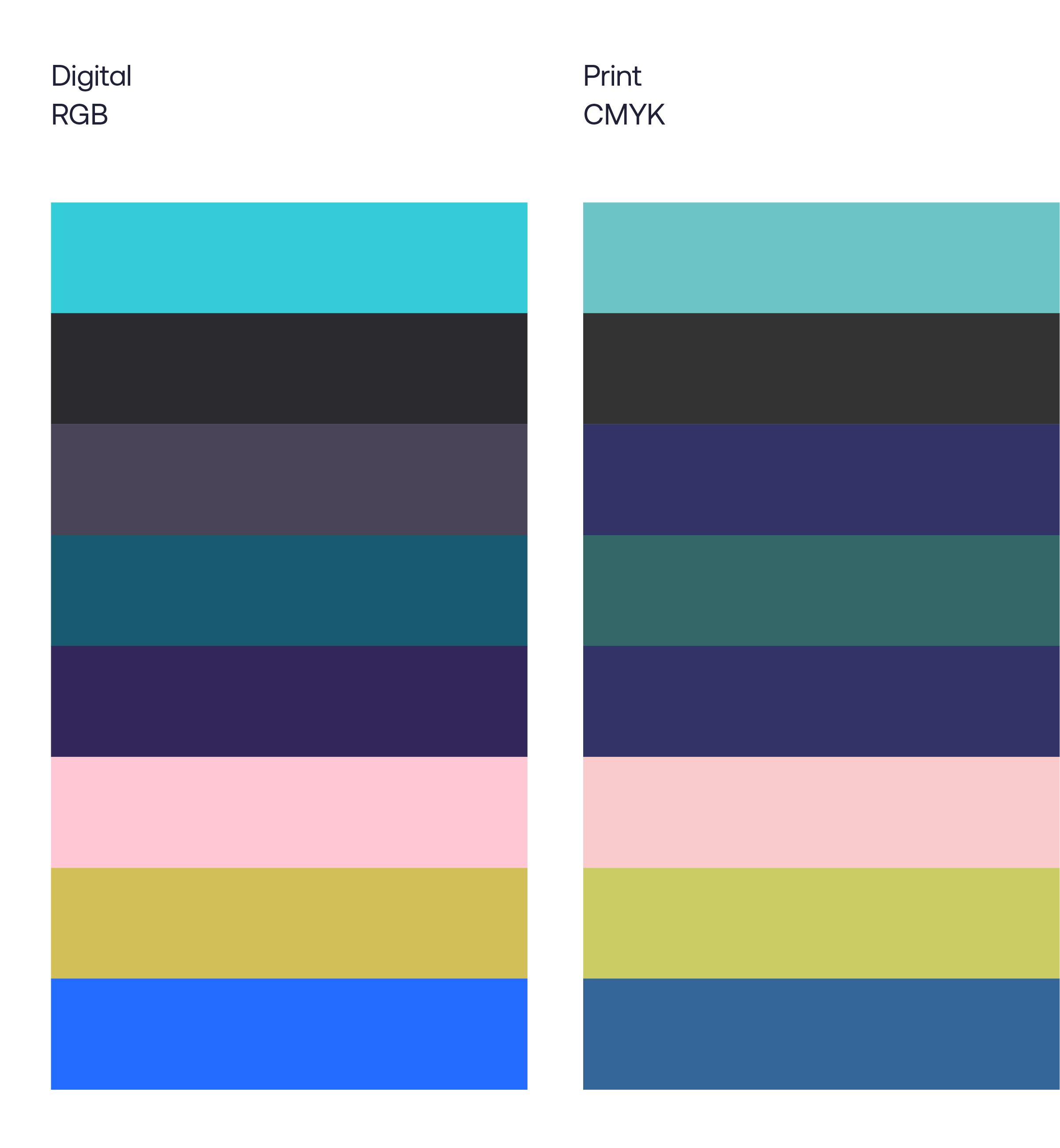
It is normal for printed colors to look different from colors on digital screens
Color Use
How we use color is important in maintaining the look and tone of brand. Here are some examples and recommendations for color use.
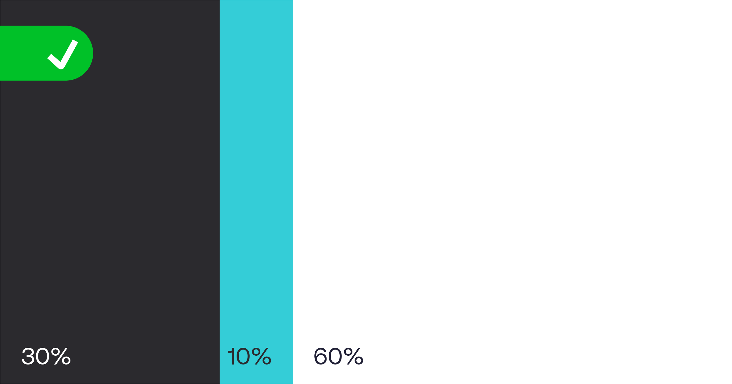
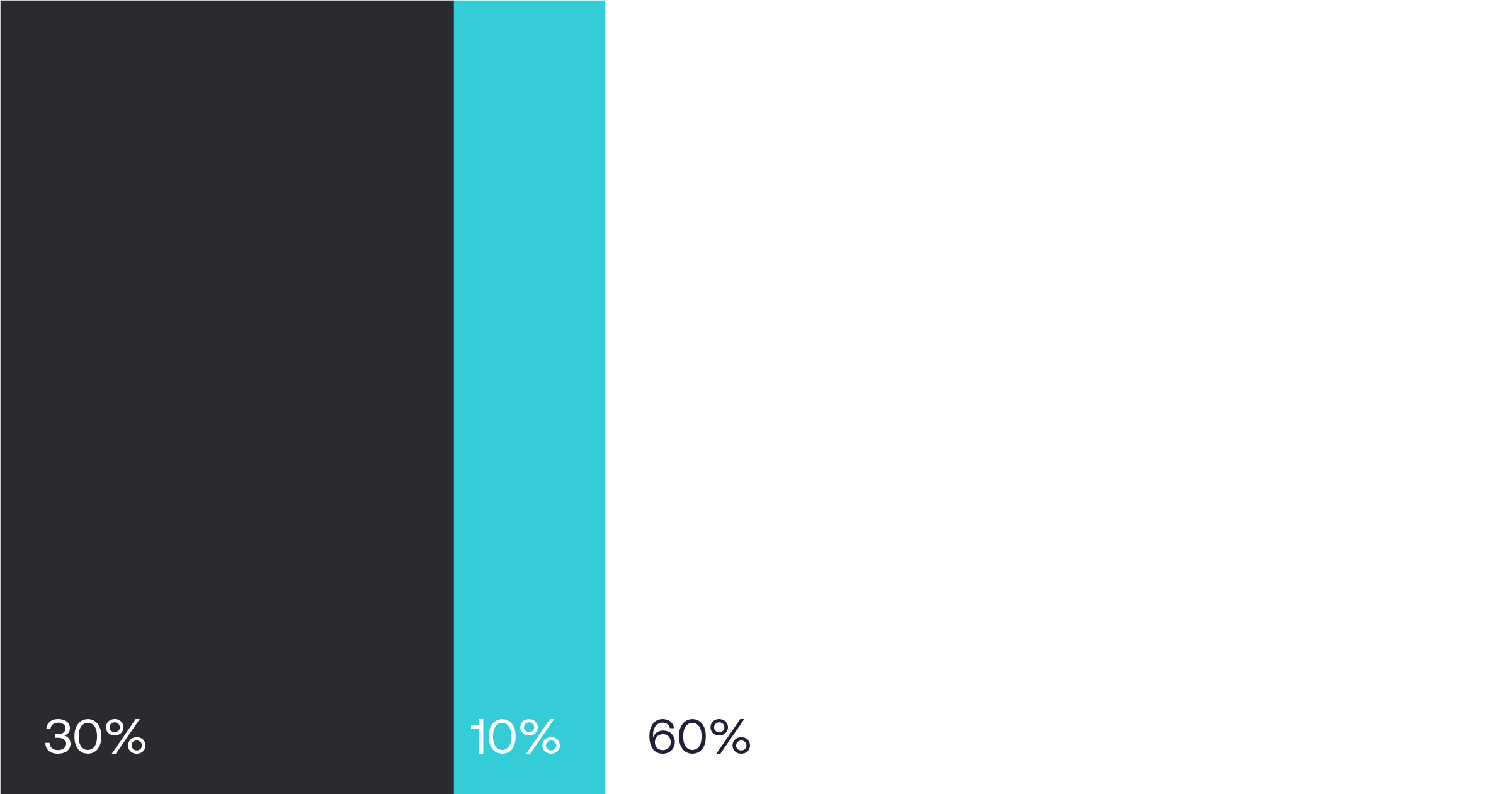
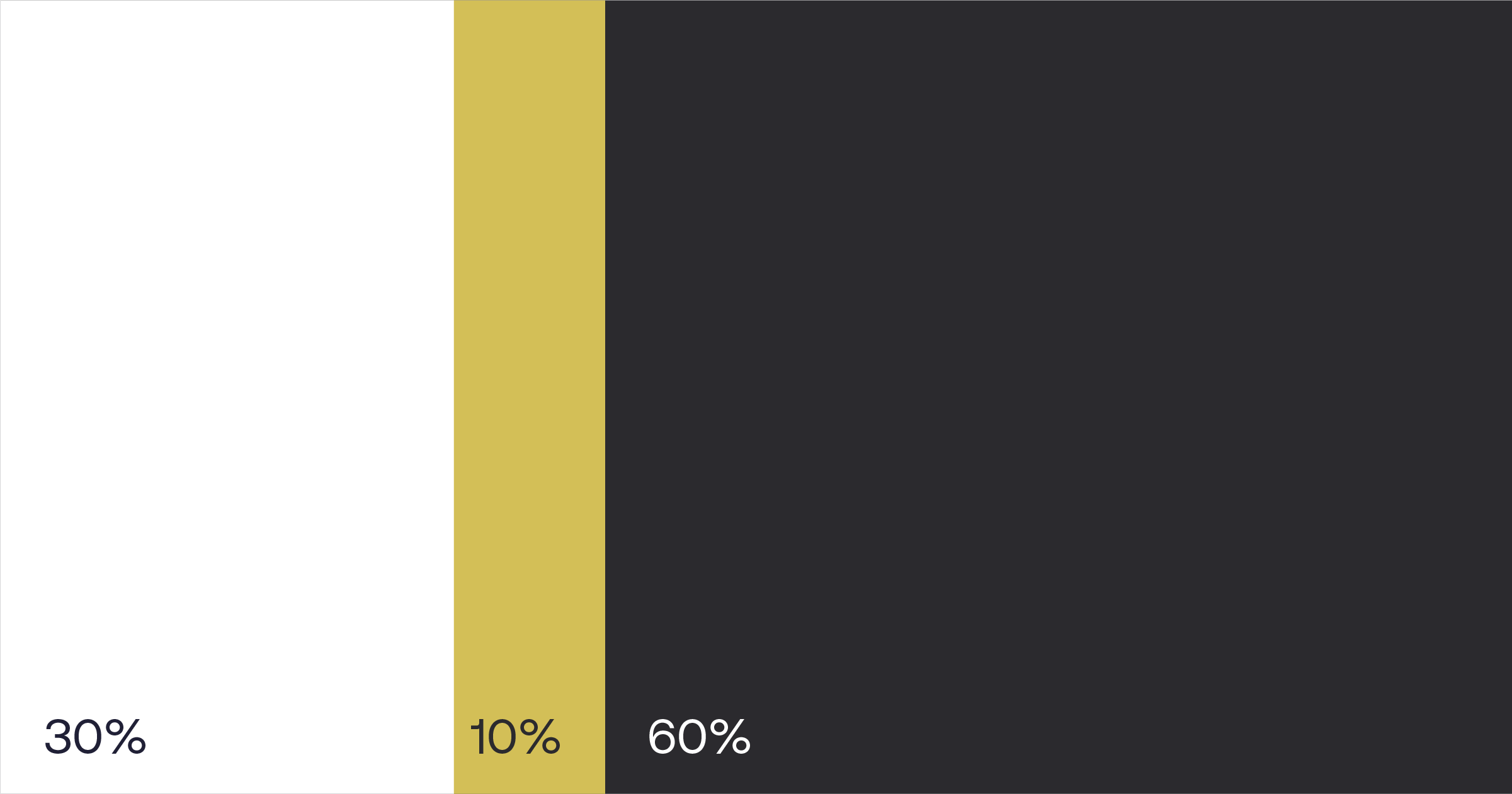
In general, it's recommended to use a combination of 1 bright color, 1 dark color and white. This provides balance and contrast.

If using 2 colours, it's better to use 1 bright and 1 dark for contrast
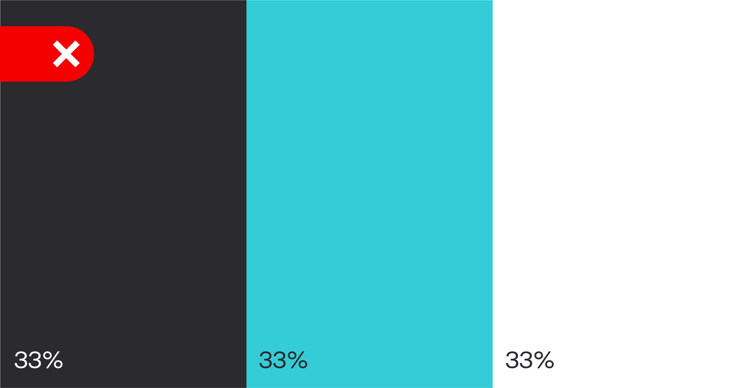
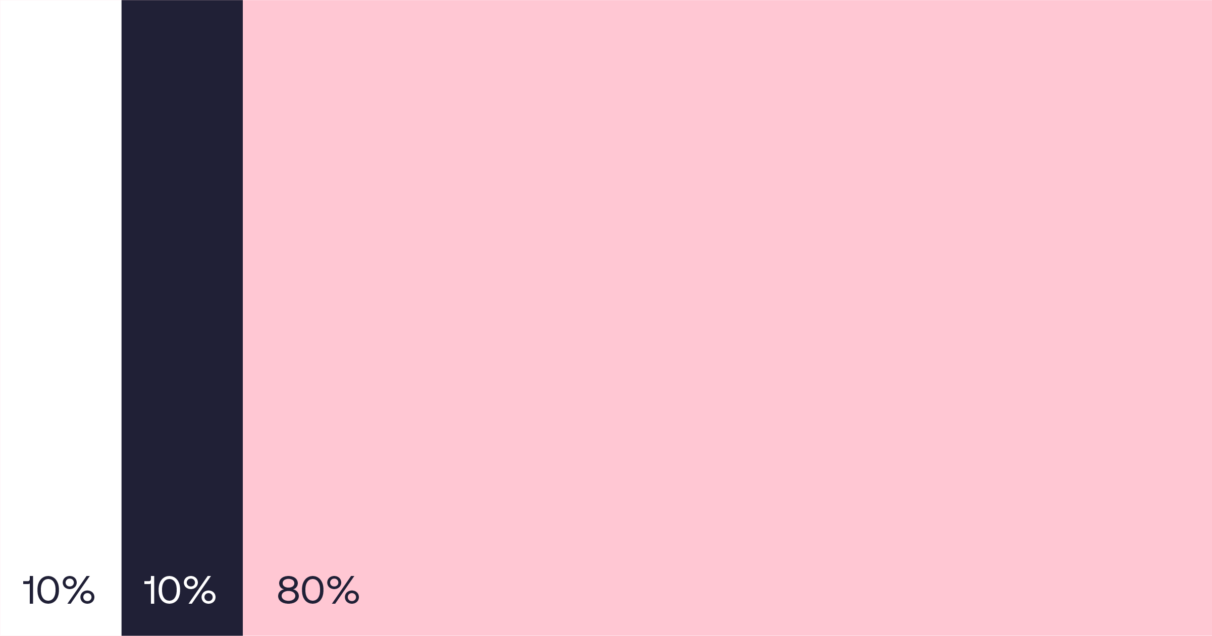
DO NOT use colors in even splits - this causes problems with balance and hierarchy
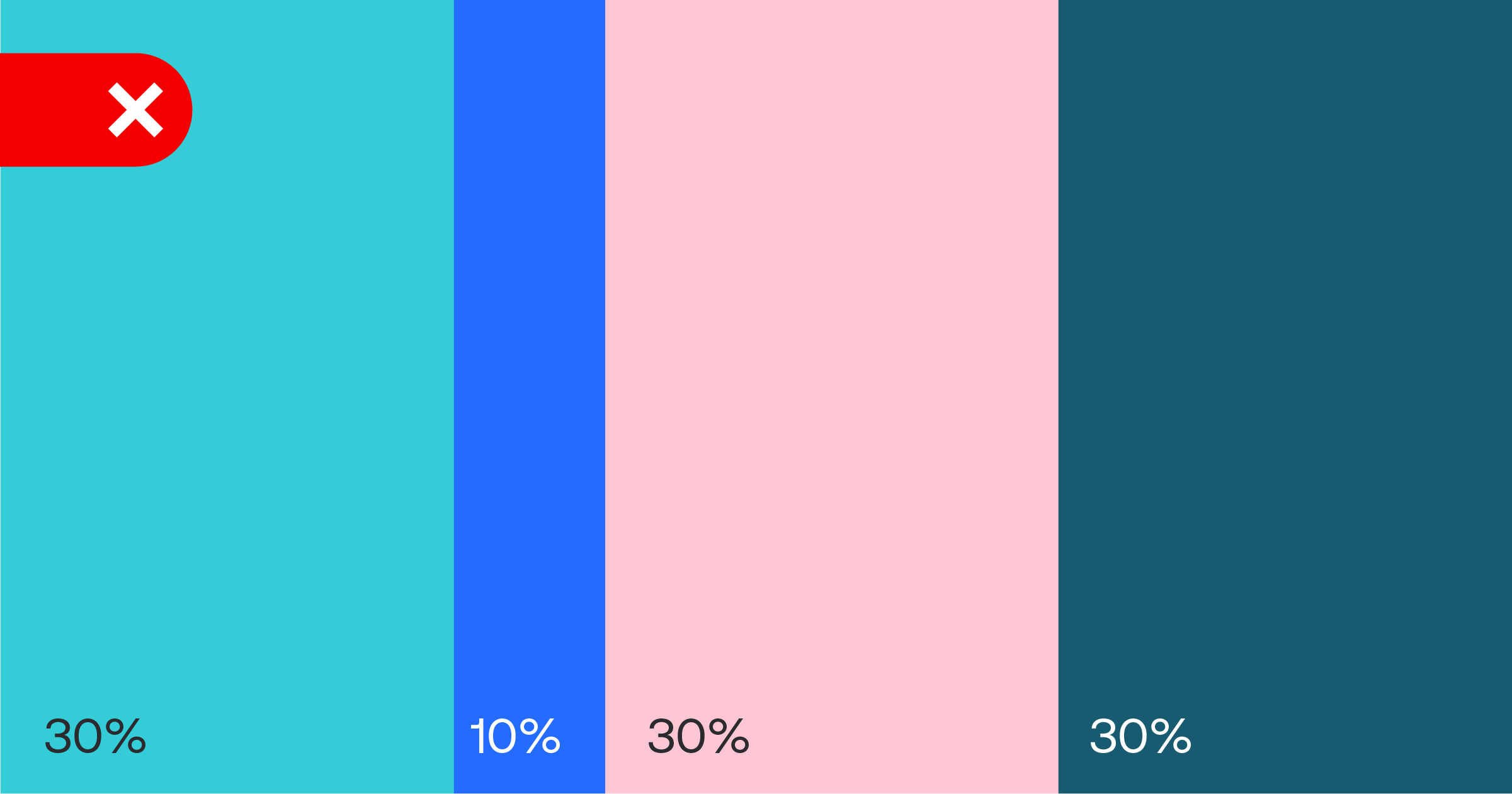
IT IS NOT RECOMMENDED to use more than 3 colors

IT IS NOT RECOMMENDED to use more than 3 colors

DO NOT use all the Soracom colors together
Color Use Examples
Here are some examples of correct color usage: