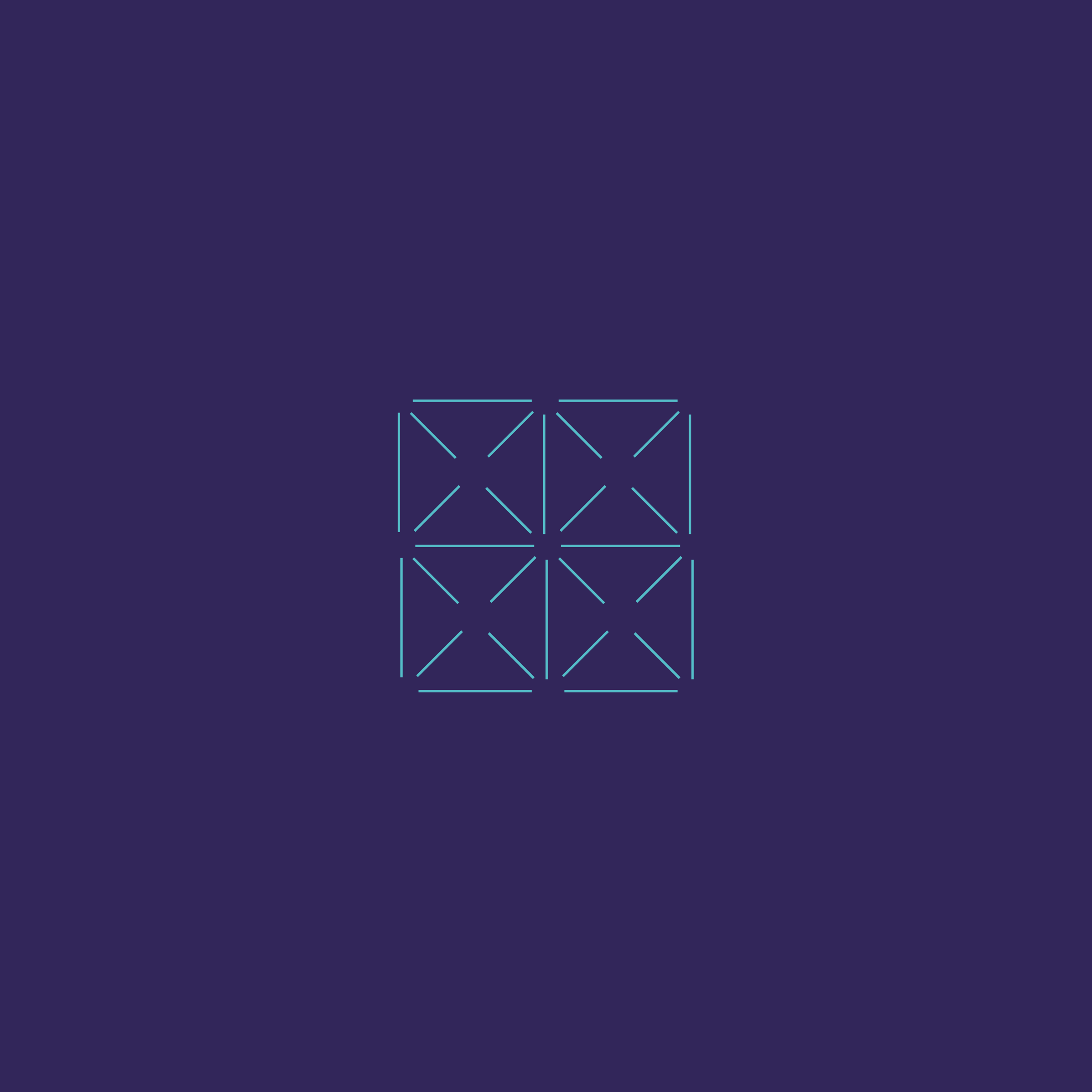
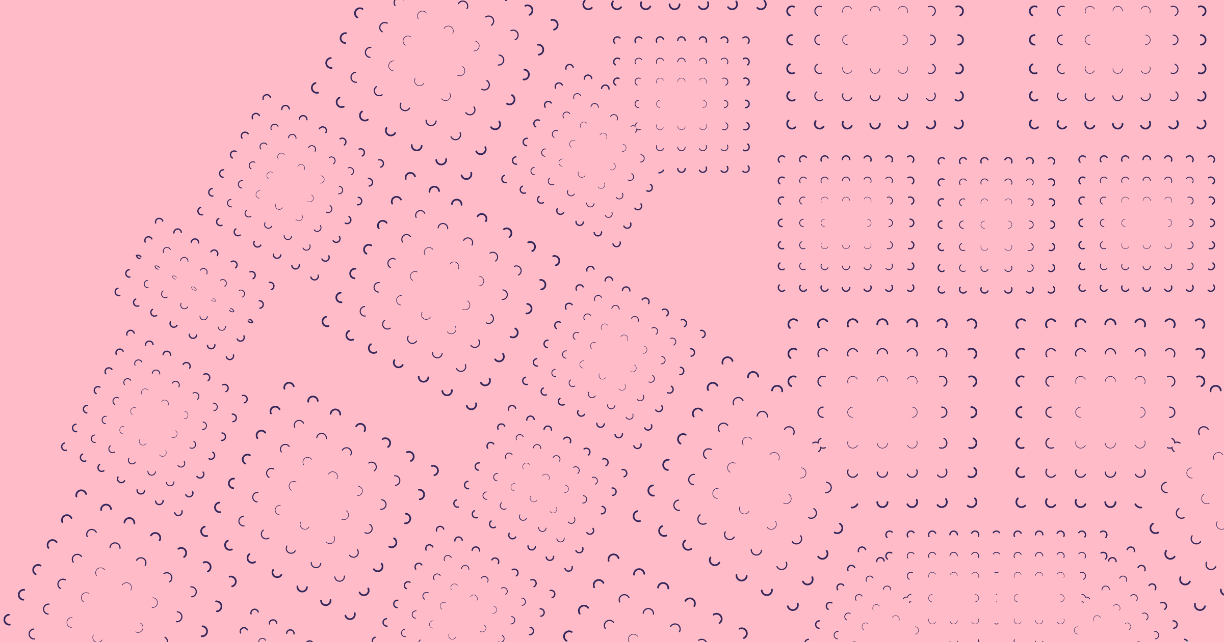
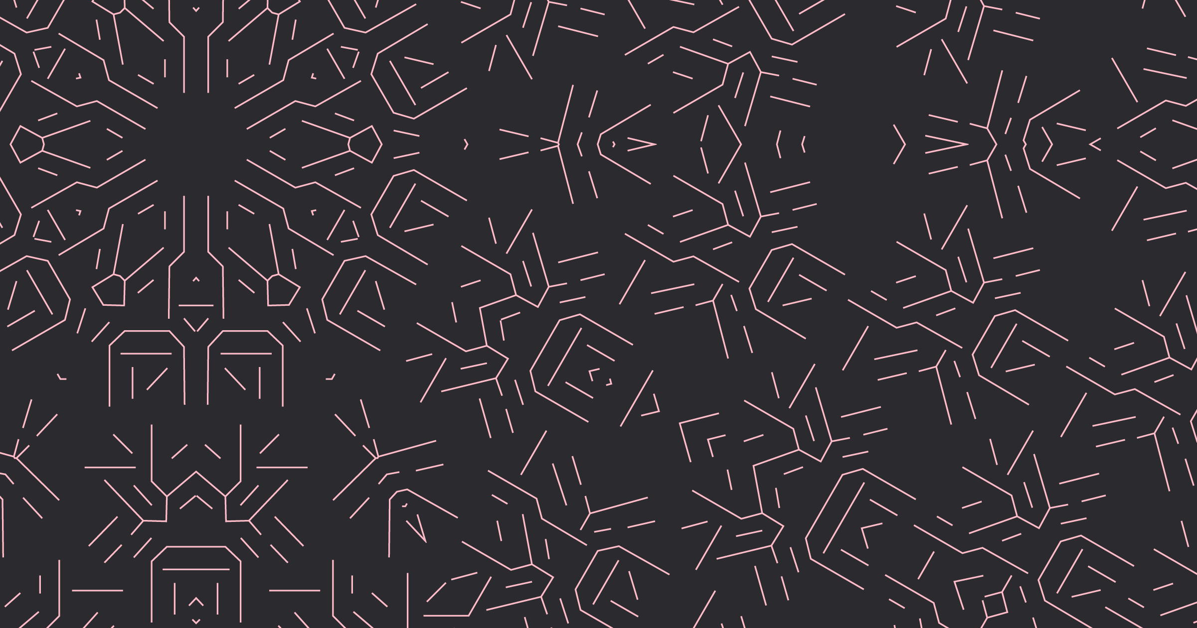
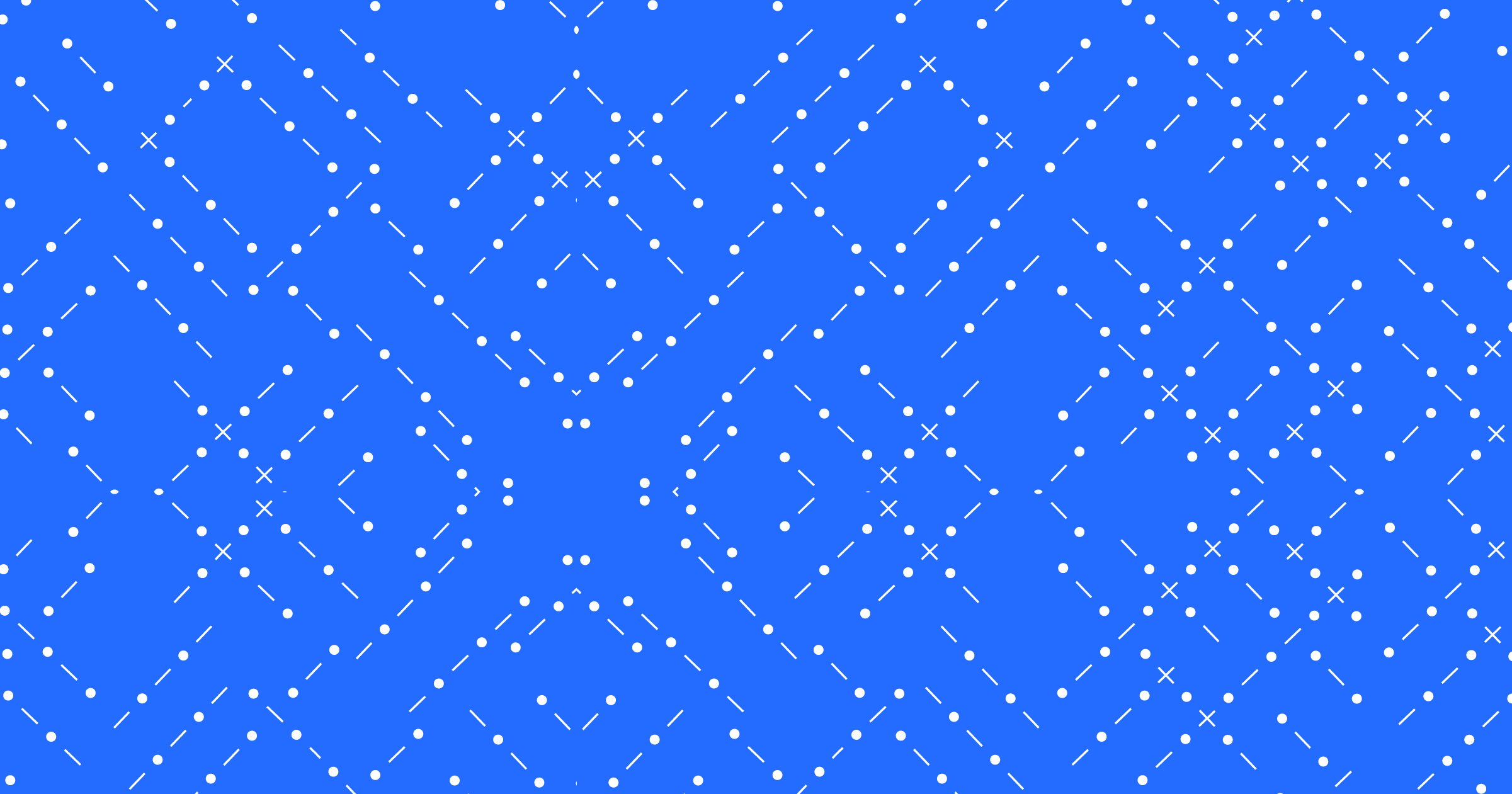
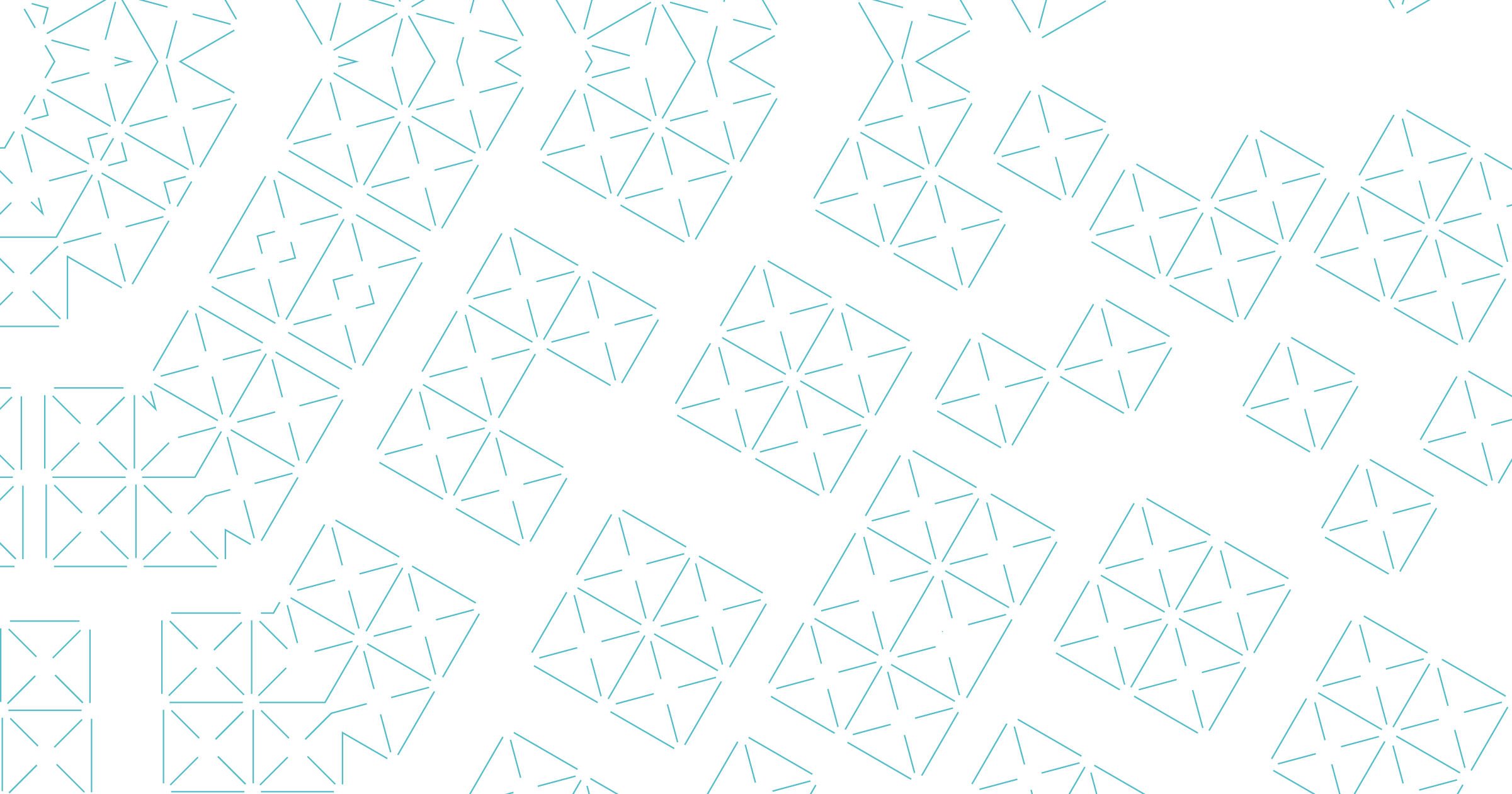
Patterns & graphics
The patterns below are used to form textures and connectivity maps which are the foundation of our brand aesthetic.
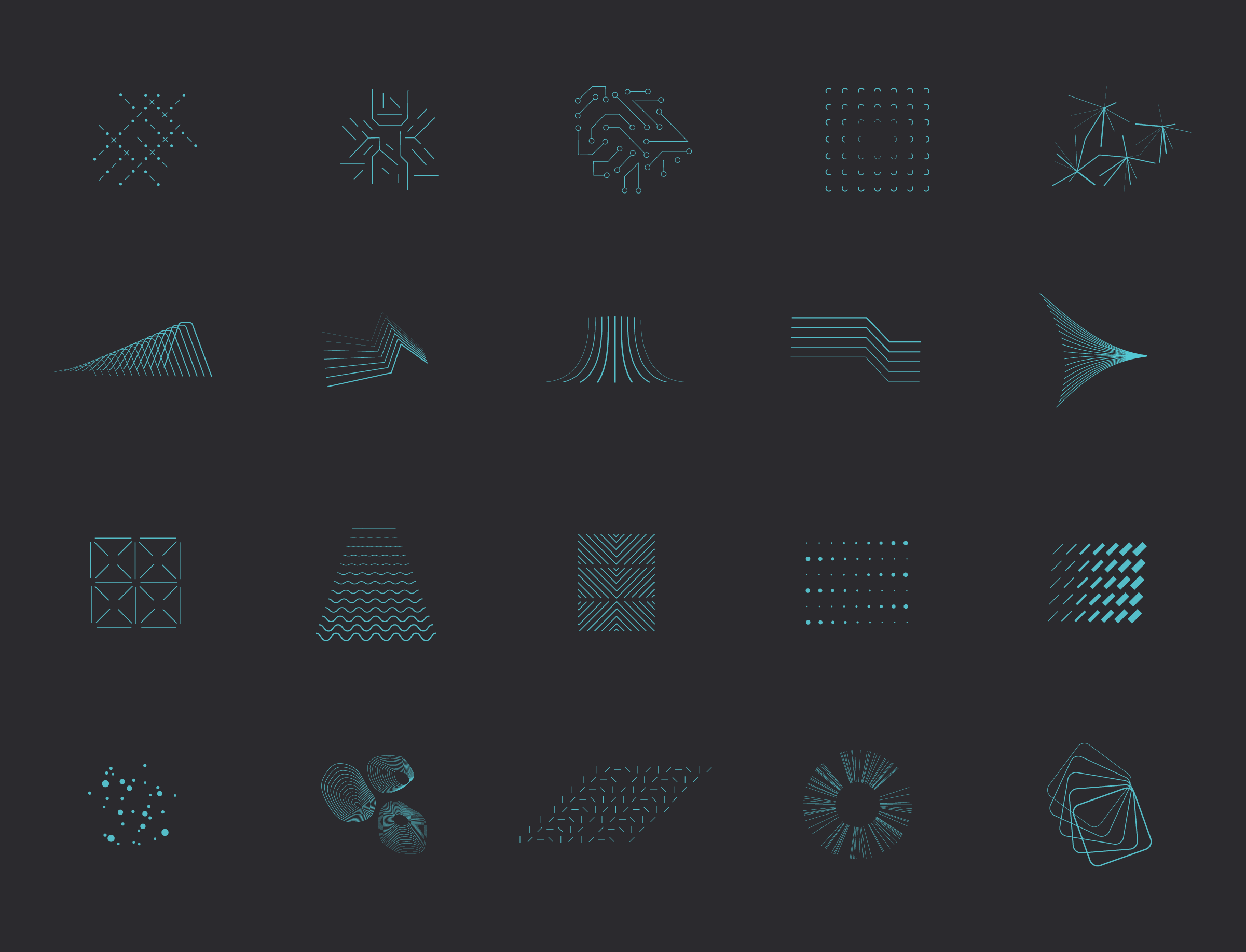
Here are some examples of our graphics.


Downloads
| Description | Format | Size | Download |
|---|---|---|---|
| Celeste Single Patterns (EPS, PNG & AI) | ZIP | 8.43Mb | Download |
| Blue Single Patterns (EPS, PNG & AI) | ZIP | 8.49Mb | Download |
| Pink Single Patterns (EPS, PNG & AI) | ZIP | 8.89Mb | Download |
| White Single Patterns (EPS, PNG & AI) | ZIP | 8.02Mb | Download |
| Purple Single Patterns (EPS, PNG & AI) | ZIP | 8.46Mb | Download |
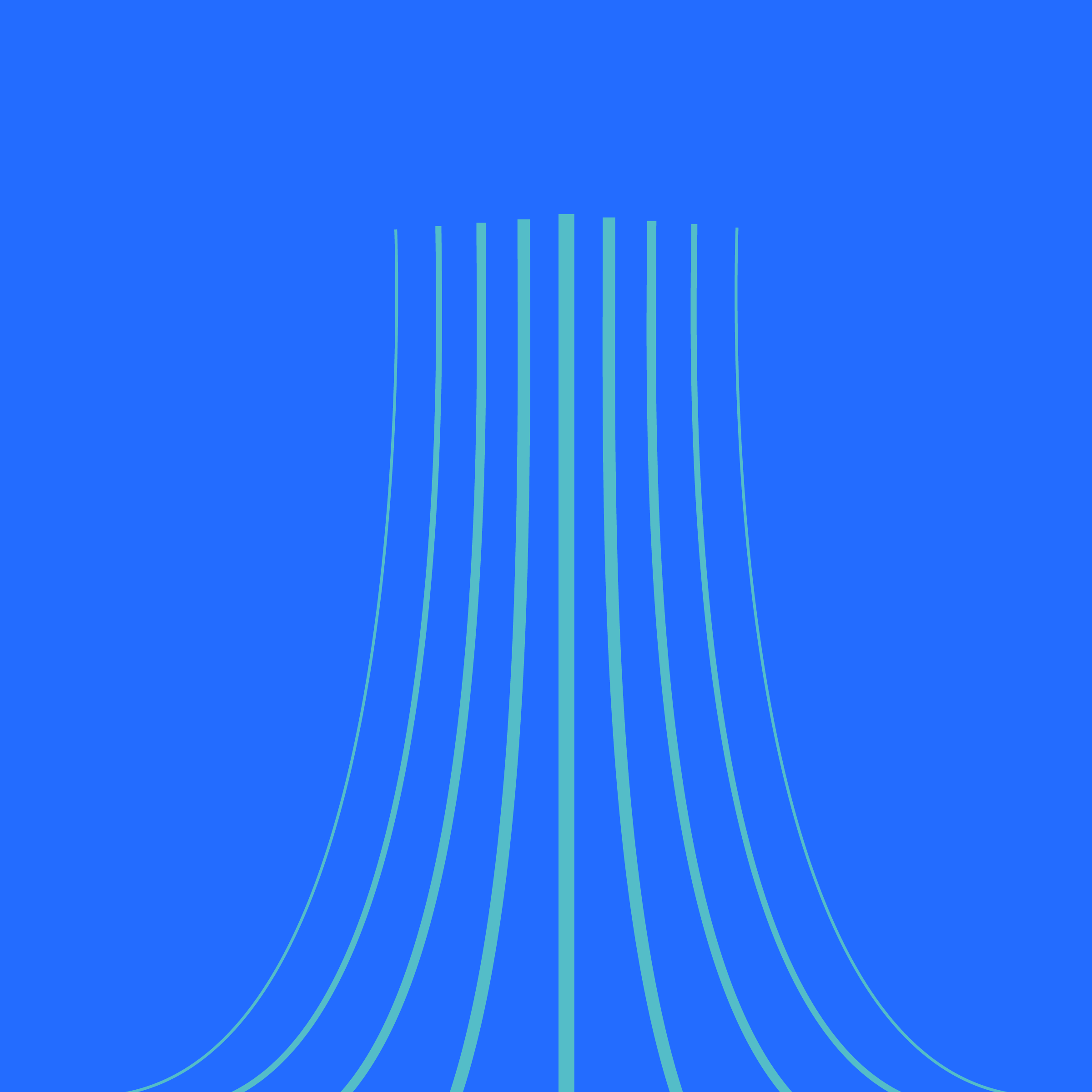
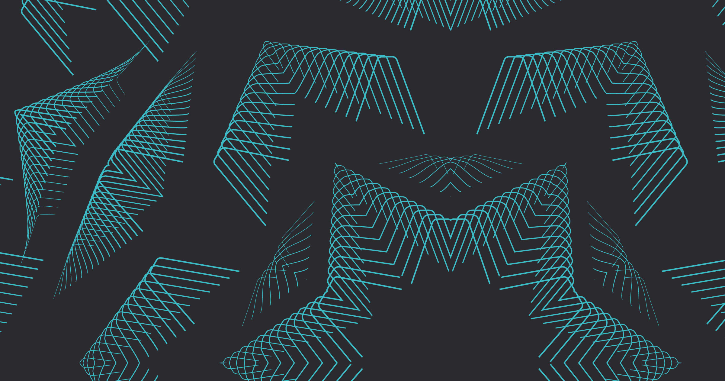
Textures
Our textures are created from our patterns and graphics using our Texture Creator tool. These are primarily used to communicate our different themes of connectivity; scale, acceleration, creativity, connection, speed, integration and encompass our over-arching brand ethos which connects to our messaging.


Downloads
| Description | Format | Size | Download |
|---|---|---|---|
| Celeste Textures (EPS, PNG & AI) | ZIP | 32.75Mb | Download |
| Blue Textures (EPS, PNG & AI) | ZIP | 32.75Mb | Download |
| Pink Textures (EPS, PNG & AI) | ZIP | 32.28Mb | Download |
| White Textures (EPS, PNG & AI) | ZIP | 29.8Mb | Download |
| Purple Textures (EPS, PNG & AI) | ZIP | 32.73Mb | Download |
Texture Creator
Please download and follow the instructions below when creating new textures. We use this tool to generate new textures and give more variety to visual communication.
Downloads
| Description | Format | Size | Download |
|---|---|---|---|
| 2 Point Texture Creator - Adobe Illustrator File | ZIP | 1Mb | Download |
| 4 Point Texture Creator - Adobe Illustrator File | ZIP | 1Mb | Download |
| 6 Point Texture Creator - Adobe Illustrator File | ZIP | 1Mb | Download |
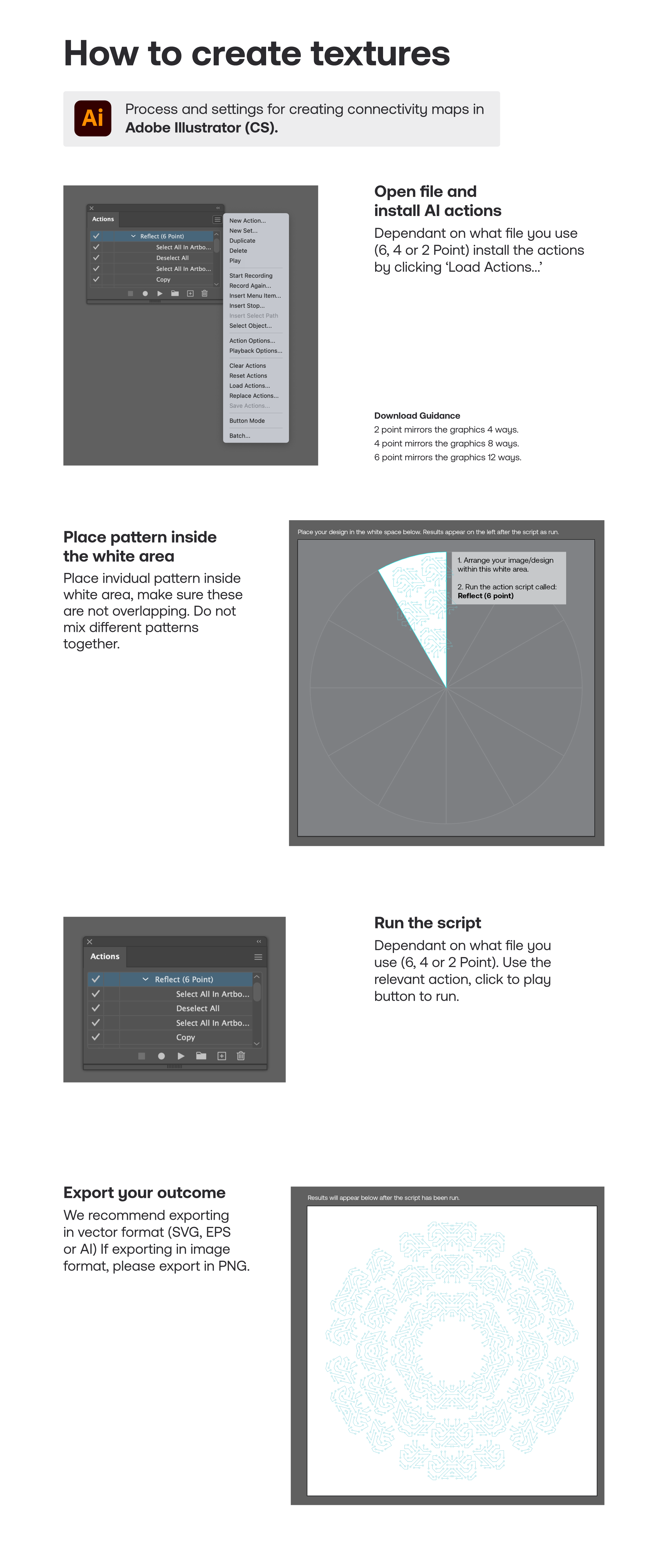
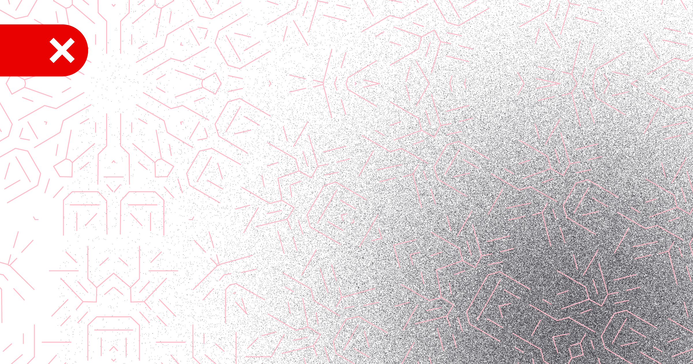
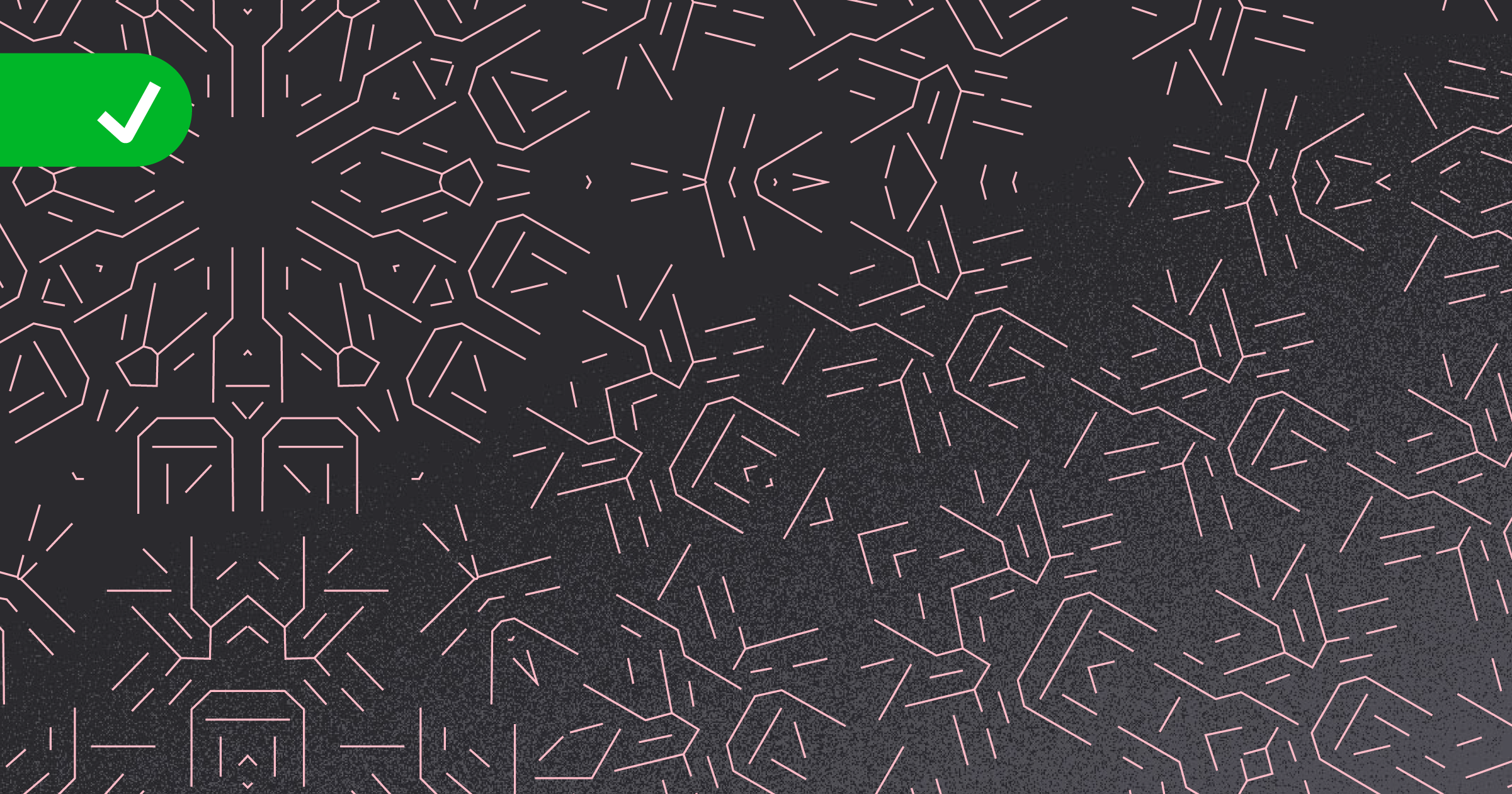
Do’s & Don’ts
Our textures should only be used as shown in these guidelines. Any other use can reflect badly on our brand. Here are some specific things that should be considered when using textures.
Scaling & Cropping

DO NOT use textures in full size, you must always scale and crop textures at points of interest

Correct use of textures
Color combinations

DO NOT change colors of textures

Correct use of a color combination
Shadient use
DO NOT use shadients in wrong colour combinations
Correct use of a shadient behind texture
Combining textures
DO NOT combine two different textures together

Correct use of using a single texture
Overlaying text

Do not use the same colour text on top of a texture

Correct use of text over a texture
General layout
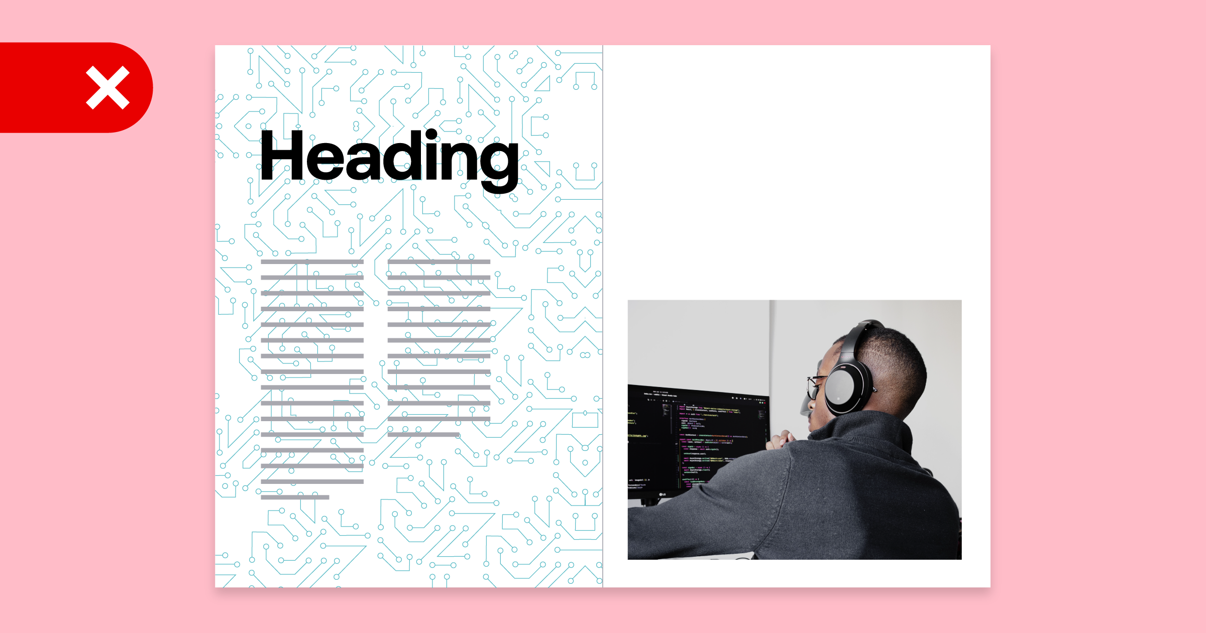
DO NOT place textures behind long form content
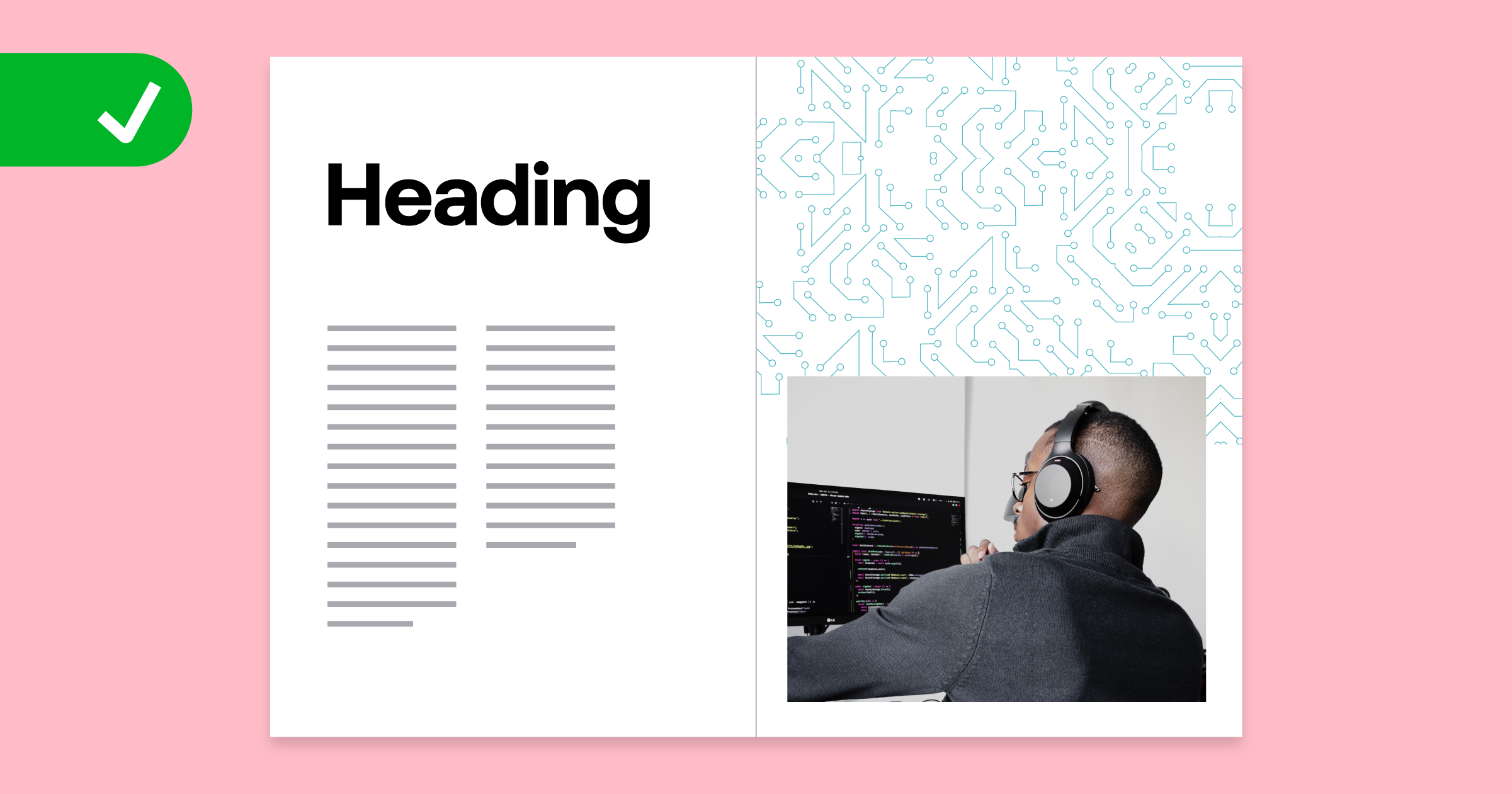
Correct use of textures, use in whitespace
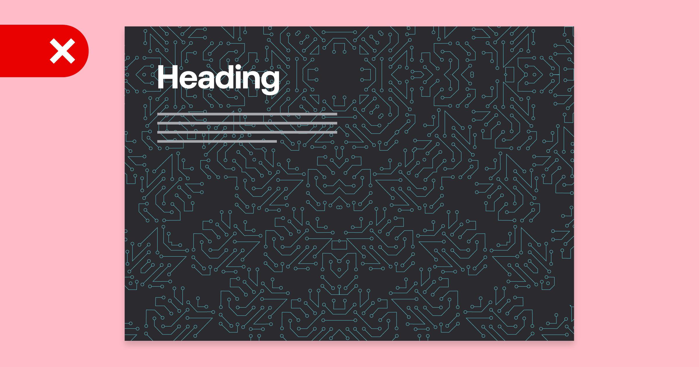
DO NOT use textures across large spreads which have smaller copy
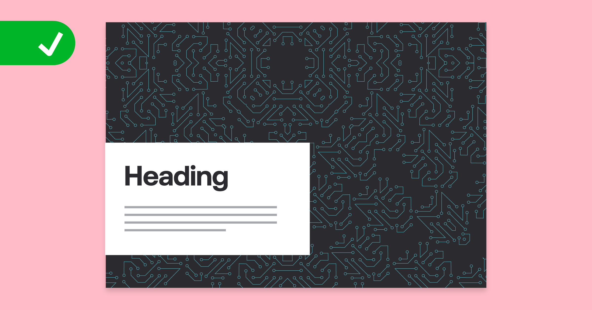
Correct use of textures across large spreads and covers
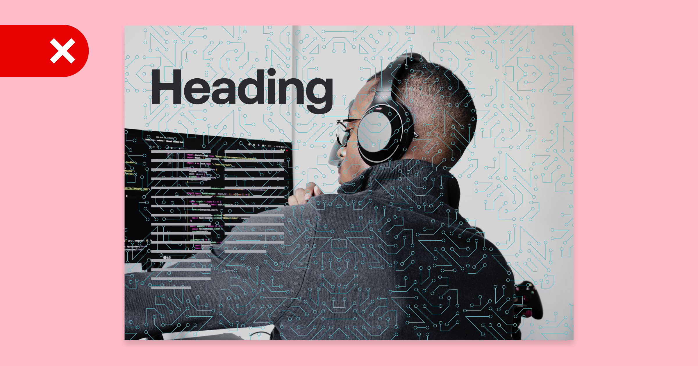
DO NOT use textures on top of imagery
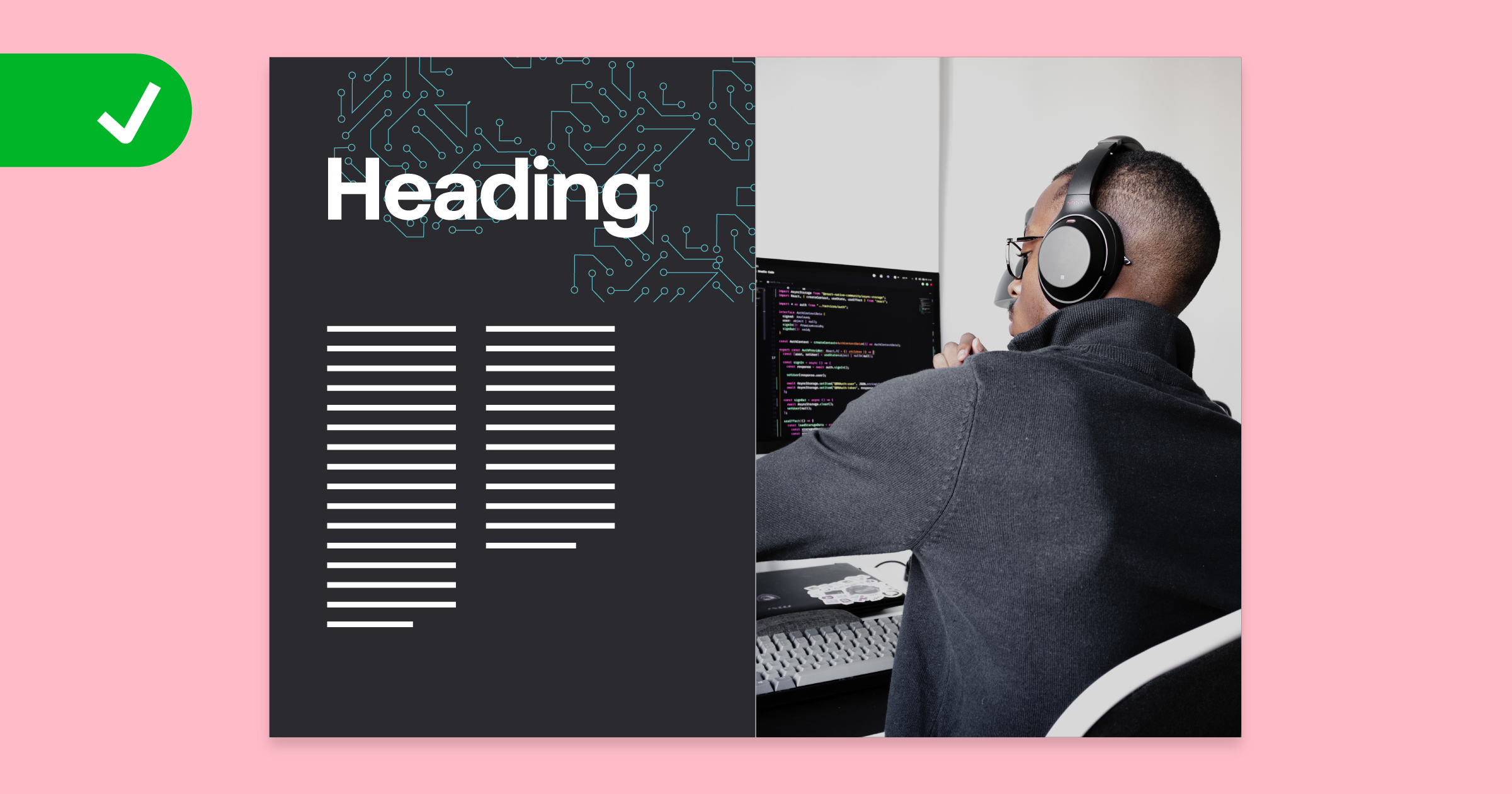
Correct use of textures with imagery