SDS updates
A lot of updates and new features have been added to SDS for the Discovery release of the user console including new dashboard and dark mode support.
Dashboard support
A range of tweaks, bug fixes and new features have been added to support the new dashboard feature of the user console.
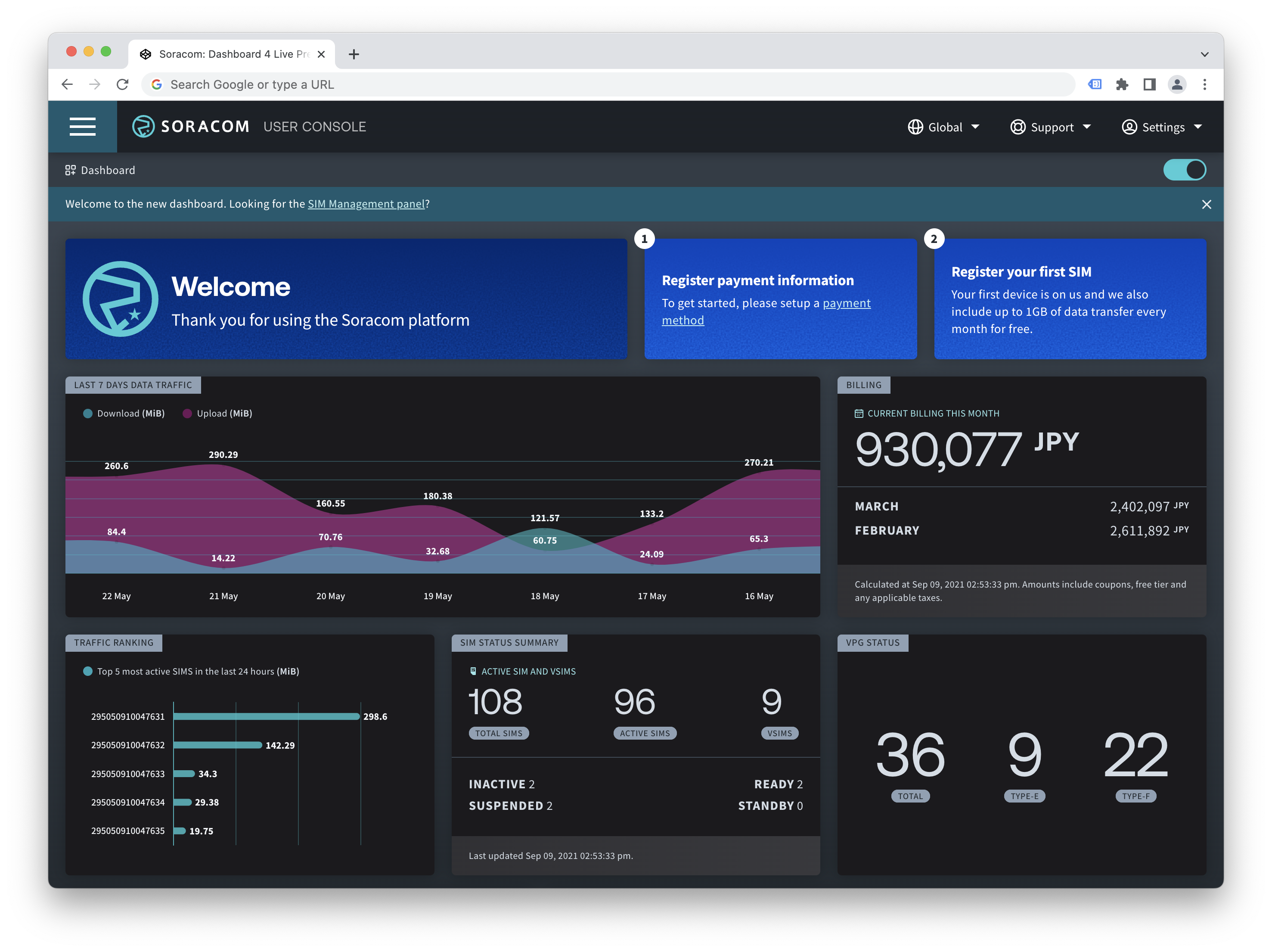
Charts
SDS now includes chart.js configuration files that can be loaded directly to style charts. These configuration files allow you to use a standard javascript module import for a specific bar chart style and will style the chart to standard SDS look and feel. Currently there is support for bar charts (both vertical and horizontal), line charts and area charts.
View the SDS Chart documentation.
Dark mode
With the release of dark mode support in the user console, new dark mode documentation has been added to SDS, including html examples and reference javascript required to allow users to set their preferred theme.
View the SDS Dark mode documentation.
Loading state
Loading state has been standardized and expanded across more components.
See each components documentation for more details.
Message states
Message state is new, and has been added to the same list of components as loading state. Message state allows you to quickly set a message on a component with minimal effort.
This may be useful to show a message if a component returned and error, or if the component was still updating. Message state is an extension of the loading state options, and both can be used at the same time.
See each components documentation for more details.
Switch updates
The ds-switch component and documentation has been completely rewritten to add support for icons, multiple choice style switches and automatically adding texttips to any switch using the --hide-label option.
Bug fixes
Numerous component bug fixes, including:
- ds-tag – chrome styling issues
- ds-select – windows styling issues
- ds-richtip – fixed wide content being overflowed
- ds-banner – narrow styling improvements
- ds-card - narrow styling improvements